Blockware Intelligence Newsletter: Week 1
In-depth look at Bitcoin market trends from the week of 8/6-8/12
Dear readers,
Hope all is well and you had a great week. For prior subscribers, I have signed on with Blockware to help build out market intelligence and grow their brand. Super stoked to be part of the team. For subscribers that got moved over from the previous Blockware newsletter list, nice to meet you. Hope you enjoy!
It’s been a steady week in the crypto markets, with price grinding upwards from 40K to just shy of 47K, followed by a slight pullback to 45K at the time of writing. Let’s dive into some important data trends from this week, primarily focused from an on-chain perspective.
Here’s some high-level takeaways for this week:
- Accumulation strong based on several measures
- Large whales have been buying heavily the last 2 weeks
- Funding remains low, Bids being moved up + On-chain accumulation (rally is spot driven)
- Long-term holders are not taking exit liquidity, Market is trading in a state of profit once again
- Hash showing signs of recovery, Hash Ribbon buy signal, Miners accumulating (likely because they are so profitable)
- Still low transaction count, but large transaction volume
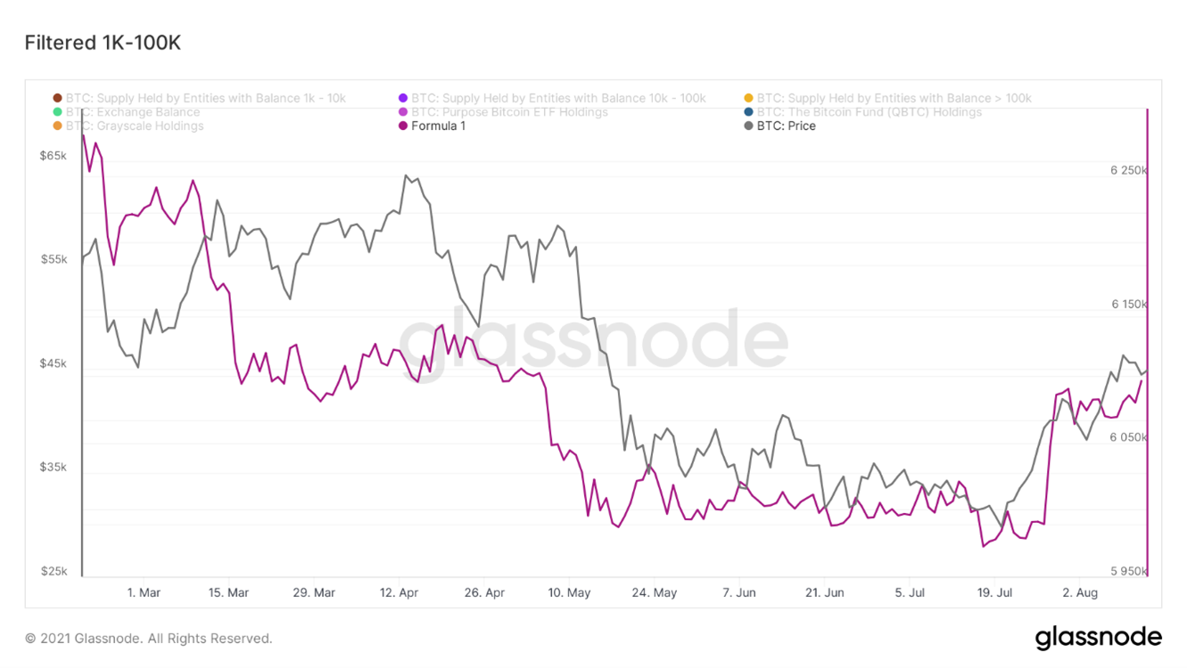
One of the most interesting developments over the last 1-2 weeks has been the increase in the holdings of entities (forensically clustered addresses) with over 1,000 BTC (aka whales). This is after filtering out large recognizable on-chain entities such as Exchanges, Grayscale, QBTC, Purpose ETF, etc. Since July 27th whales have added 107,150 BTC to their holdings.
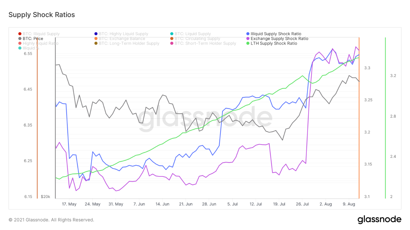
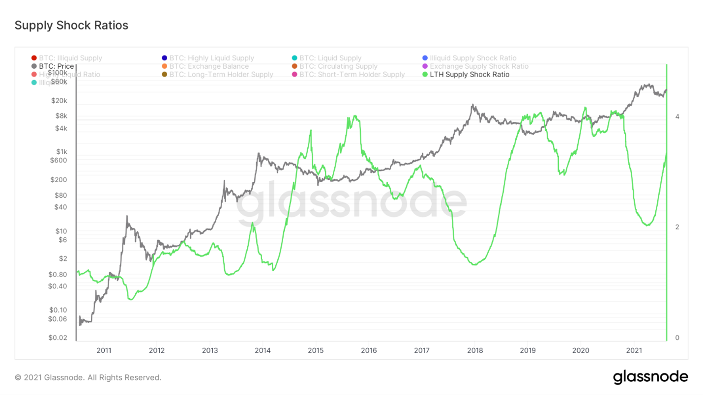
On a similar note, we can look at 3 measures of supply shock in the Bitcoin market that are also suggesting accumulation. Let’s break each of these down to get a better sense of what they each represent.
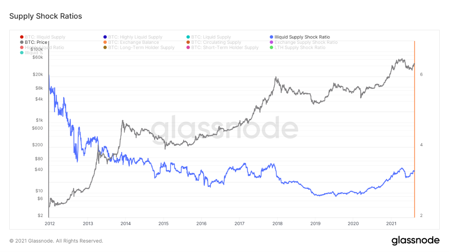
Firstly, we have Illiquid Supply Shock Ratio, a ratio I created with help from Willy Woo. This compares the amount of BTC held by entities with little selling history (strong hands) to the amount of BTC held by liquid and highly liquid entities (weak hands). Essentially, this ratio captures the movement of BTC from weak to strong hands. Zooming out, we see that throughout Bitcoin’s speculative history the ratio has trended down, as a larger portion of supply became liquid. That was until after March 2020 as the macro trend of the ratio reversed and more coins started getting locked up by long term investors. Zooming in, we see this was a leading indicator in May as supply started to rapidly become liquid. It was also a leading indicator over the last month before this current rally Bitcoin has gone on following the failed breakdown below $30K. The recovery in this metric has been quite impressive since May 19th, currently sitting at the equivalent to what priced BTC at $55K-$57K earlier this year.
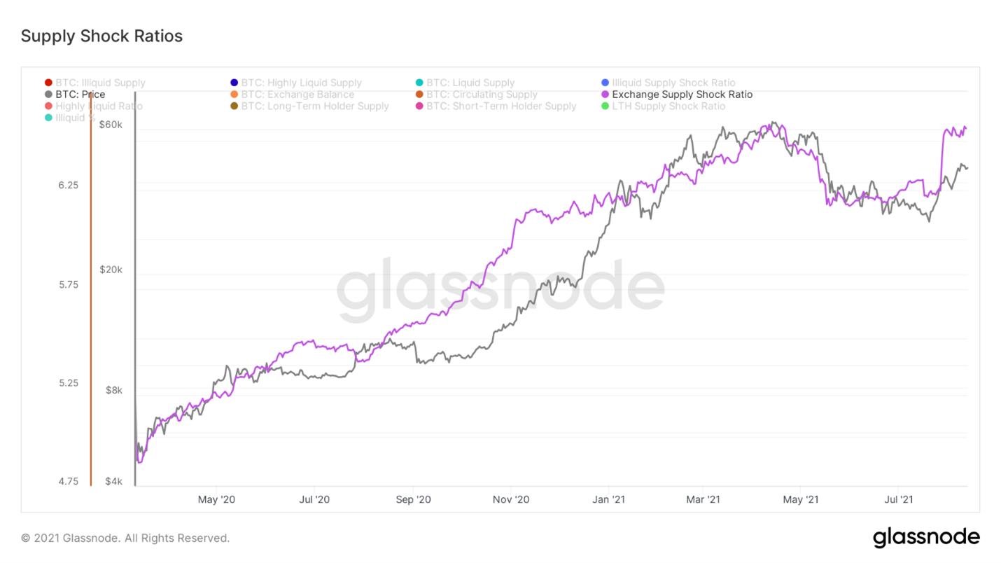
Next, we have the exchange supply shock ratio. With illiquid supply showing a qualitative aspect of the buyers scooping up coins, this ratio shows a more quantitative view of the supply lock-up. This literally is measuring the number of coins available to buy on exchanges against overall supply. Once again, seeing a strong recovery in this since May 19th with exchanges down 109,421 BTC in the last 3 weeks.
And third we have the long-term holder supply shock ratio. This is comparing the amount of supply held by entities that have held their coins for at least 155 days to the amount of supply held by short term holders. The 155-day threshold used for long-term holders was deemed a line in the land for likelihood of spending by Glassnode; the research/statistics behind this is published on their website. Historically, when long-term holders possess a large enough portion of supply we can a supply shock effect on the market. This is currently moving up aggressively alongside the other two ratios previously mentioned.
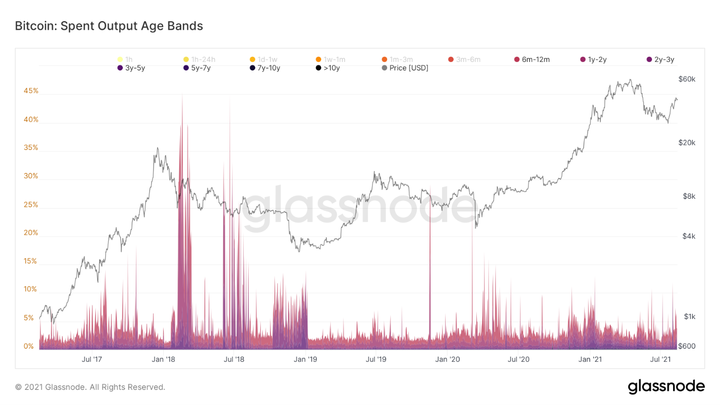
One of the main frameworks being pushed lately online regarding market structure has been that this rally is just a dead cat bounce, and we are in the process of setting a macro lower high. Data from long-term holders can give us some key insight into whether this may/may not be the case. During the 2017 dead cat (the scenario many seem to be basing this framework on) there was massive sell-off from market participants that hadn’t moved their coins in at least 6 months. They took exit liquidity on the first opportunity that they were given. We are not in fact seeing that same behavior currently, invalidating the dead cat bounce narrative from an on-chain perspective thus far. Long-term holders are currently sitting tight and holding strong.
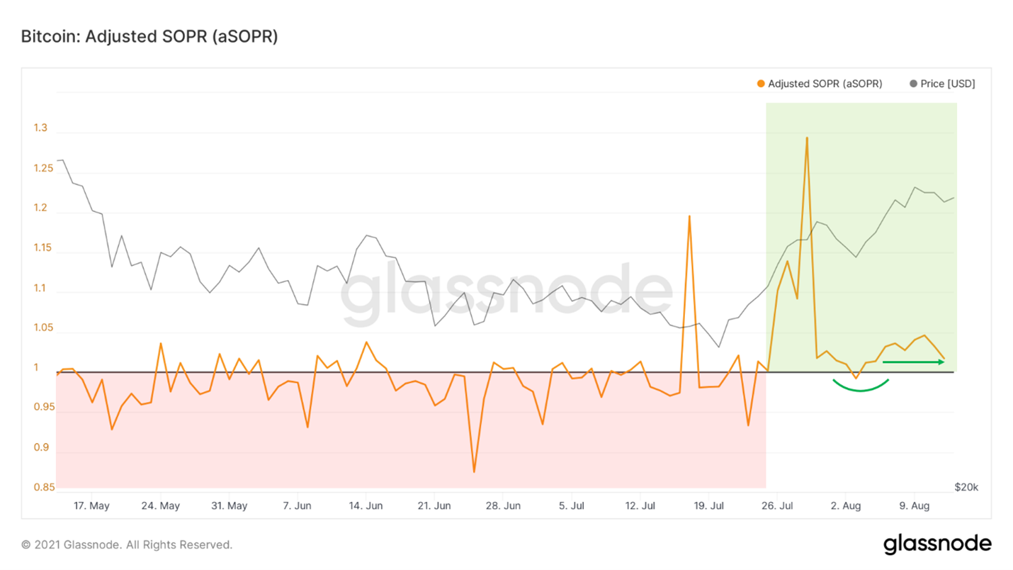
To look at the profit held by the coins being moved we can use SOPR (spent output profit ratio) and filter out outputs with a lifespan below an hour for better signal. When above 1, the coins trading on that given day hold profit in aggregate. When below 1, the coins trading on that given day hold losses in aggregate. In bear markets, SOPR gets consistently rejected off 1, marking good times to short. In bull markets, SOPR consistently bounces off 1, marking good times to long. Over the last few weeks, we’ve printed a textbook bullish recovery/trend change in the metric. After the big breakout above 1, we were watching for twofold: bounce off 1 as support in a price drop and stability above 1. So far we’ve gotten the retest, now watching for a big more stability above; but so far looks good.
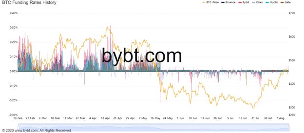
Next up we have funding rates. This is the mechanism that pegs the perpetual future contract to the Bitcoin index (weighted average of all major exchanges) price. When the perp is trading above the index price funding is positive, and vice versa, when the perp is trading below the index price funding is negative. In other words when everyone is seeking to take one side of the trade, funding incentivizes market participants to take the other side of the trade by paying them a fee for holding that position every 8 hours. The fact that funding is so low compared to where it was at the same price levels in February shows that this rally is much healthier, and spot driven rather than derivatives.
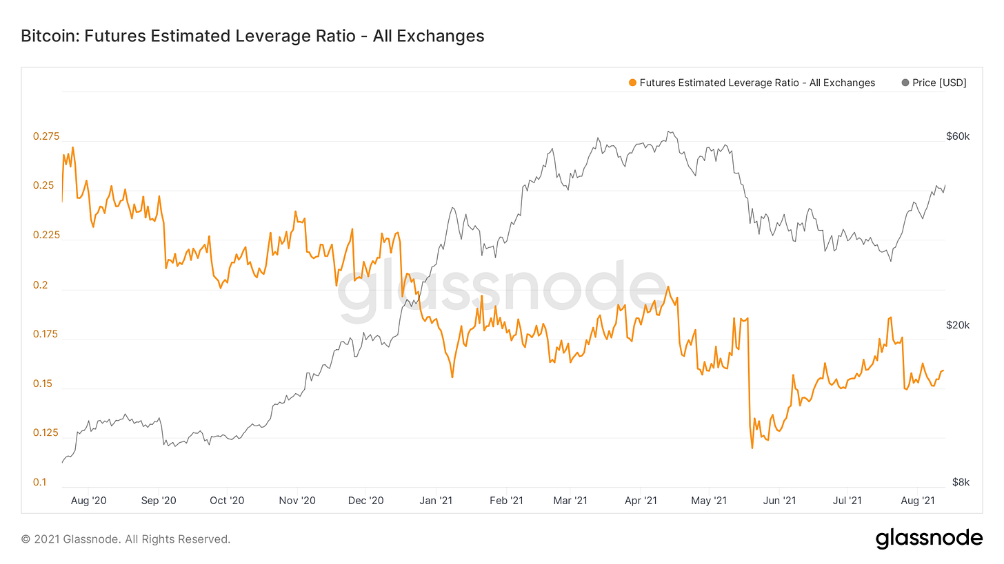
Leverage is also relatively low compared to when BTC was at the same price levels in February. Again showing this rally has been healthy.
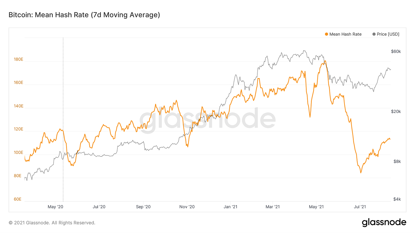
Although still far from its peak earlier this year, hash rate has slowly started to recover. This of course is a positive sign that is likely a mix of Chinese miners being done migrating and starting to plug back in their machines. This also means the security of the network is increasing.
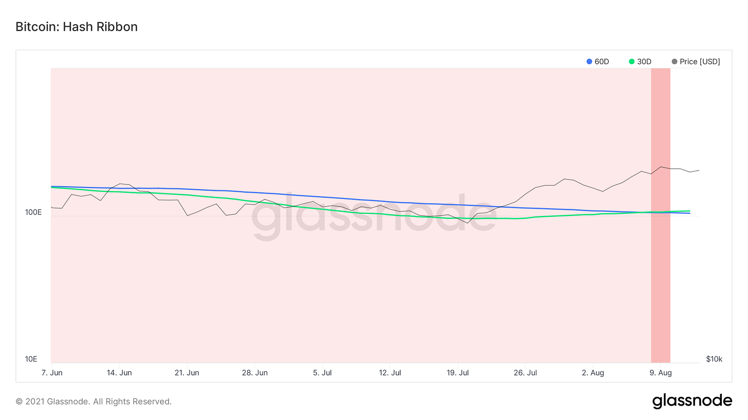
With this recovery in hash, we’ve just gotten the rare hash ribbon buy signal, one of the best historical buy signals in the Bitcoin space. This shows when the 30-day moving average of hash crosses over the 60-day moving average. Essentially this marks the end of miner capitulation phases, meaning the subsiding of forced sell pressure on the market.
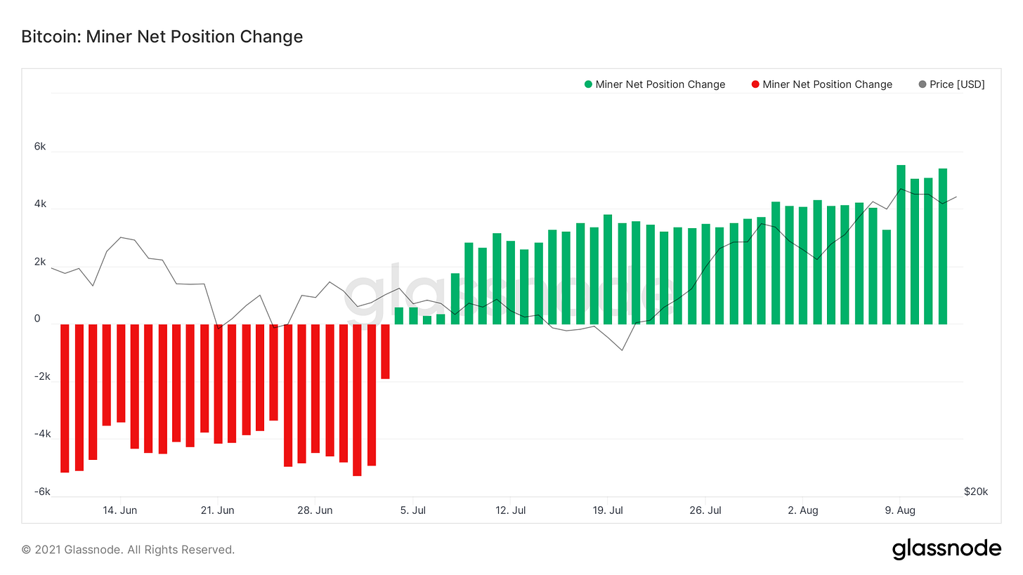
This is also evident in the miner net position change metric, which tracks the 30-day change of miner balances. Seeing steady accumulation from miners, likely because those still on the network became extremely profitable after the record difficulty adjustment that followed the drop off in hash from Chinese miners unplugging.
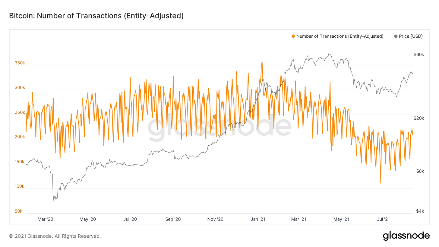
Lastly, we have the number of transactions, adjusted for movements between entities to filter out noise. Seeing a slow grind up in this but would like to see more follow through with higher prices.
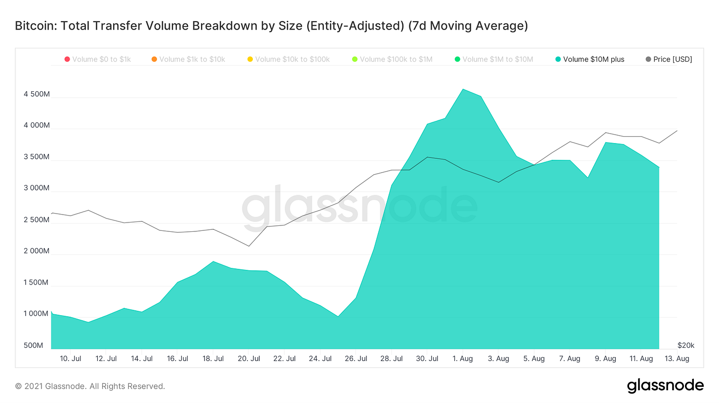
Breaking down transactions by USD value we see that although there have generally been fewer transactions, these transactions have been large. Note the increase of transfer volume above $10M, which coincides with the whale accumulation we touched on earlier.


Are supply shock ratios available to view or on Tradingview? Superb professional grade analysis! Thank u! 👏😀👍
As always, thank you for your writing! Can I translate your writing and introduce it to Koreans?