

Blockware Intelligence Newsletter: Week 30
Bitcoin on-chain analysis, mining analysis, equity-analysis; overview of 3/11/22-3/18/22


Blockware Intelligence Sponsors
FTX US - Buy Bitcoin and crypto with zero fees on FTX. Use our referral code (blockware) and get a free coin when you trade $10 worth.
Webull - Trade crypto-equities. Open an account and make your first deposit by March 31st and get three free stocks, each valued between $7-$3,000.
Blockware Solutions (Mining) - It is difficult to buy ASICs, build large mining facilities, and source cheap scalable electricity all on your own. Work with a trusted partner like Blockware to deploy capital into Bitcoin mining.
Blockware Solutions (Staking) - Ethereum 2.0 is almost here, now is the time to stake your ETH with Blockware Solutions Staking as a Service to take advantage of 10-15% APR when the Ethereum network switches over to Proof of Stake
If your company is interested in sponsoring Blockware Intelligence, please email sponsor@blockwaresolutions.com.
Newsletter Summary
A constructive week of price action for the general market indexes and ETFs with prices rising alongside breadth.
Many crypto-exposed equities appear to be forming bottoms, but the overhead supply will be significant.
2nd Consecutive Downward Difficulty adjustment in a row. Miners are earning more BTC.
How the difficulty adjustment allows us to precisely forecast the future supply of Bitcoin.
General Market Update
So far, it’s been a very constructive week of price action across many sectors of the general market. This current rally feels more significant than the other attempts, as we’re seeing a greater rate at which names are starting to participate than before.
One way we can quantify the amount of names participating in a given rally attempt is through a breadth indicator called the Nasdaq’s Advance/Decline (A/D) line.
When the A/D line is sloping upwards, it tells us that the stocks within the Nasdaq Composite are in a net increase.
The A/D line is not calculated by percent returns but instead counts a stock as a “1” if it’s up on the day and a “-1” if it’s down. This creates a value that tells us the number of stocks advancing or declining, which is then plotted daily into a line.
Nasdaq Comp. A/D Line (Marketsmith)

In the chart above, the A/D line is in blue, with red trendlines to show the potential trend change here. We can see that overall, Nasdaq stocks have been stuck in a downtrend for 17 weeks, but with breadth picking up, we should see some short-term rallying.
Bulls want to see price increasing alongside the A/D line, as more and more names join the rally, adding breadth and strength to the buying pressure.
That all being said, the indexes are all still in a downtrend. The Nasdaq is still 2% below its 50 day SMA, meaning that it is still very likely we see strong short sellers stepping in. The question that remains is will the current buying pressure be enough to squeeze out the shorts.
At first it seemed to me that risk assets were only bouncing due to commodities selling off. As of Thursday, it feels to me as though the buying is more sustainable, causing leading stocks to make new highs and beaten down tech stocks to potentially form the bottoms of bases.
That being said, base bottoms are messy and not easy to navigate. Personally, I am waiting for these beaten down names to form true entries before I enter. Many equities will likely spend a few weeks at the bottom to form a rounded cup bottom.
To form a bottom, choppiness is almost always necessary. It signifies an intense battle between buyers and sellers. The goal of a trader is to wait until that battle is most intense, signaled by a contraction of volatility prior to a break above previous resistance.
The most encouraging price action from Thursday came from the indexes. Everywhere I looked I found big trendline breaks or at least price nestled up next to a trendline, gearing up for a break.

The Nasdaq is just one example out of many showing this behavior. Also notice how the Nasdaq gapped down Thursday to retest that blue 21 day EMA. This occurred while the leading stocks advanced higher, pulling the indexes back up once it was clear buyers were stepping in.
A gap down the day after a big green day off the bottom is extremely important for gauging how strong this rally attempt may be. Will people capitulate out of fear or buy the dip?
Clearly institutions were looking to buy the dip yesterday.
That being said, diagonal trendlines don’t have much weight compared to horizontal support/resistance levels. Here are some of the key levels I’m watching for the Nasdaq, along with the 50SMA (red) and 200SMA (green).

Thursday we also saw trendline breaks (or very close to it) for QQQE, SPY, RSP, DIA, IWO, IWM and ARKK.
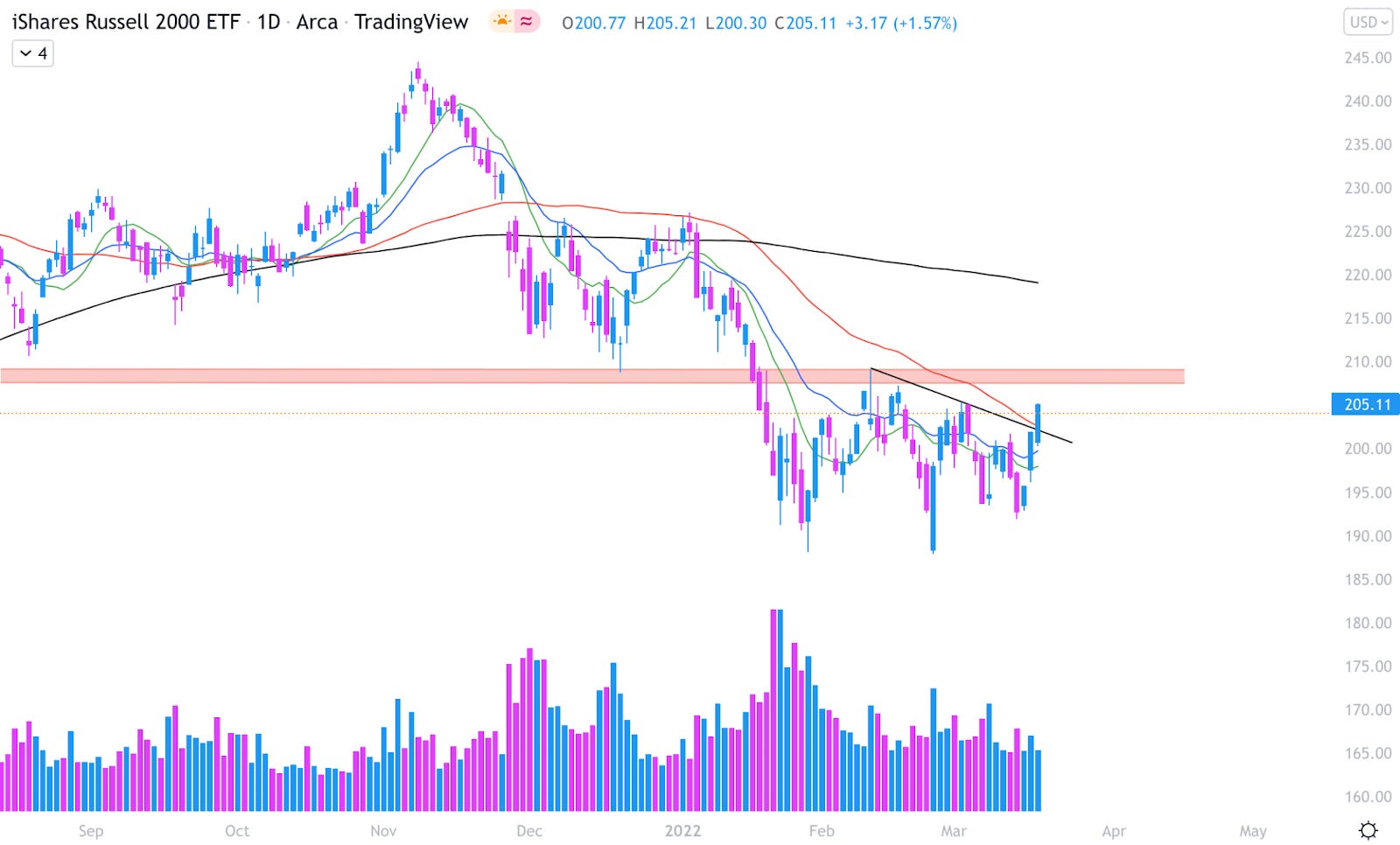
The Russel 2000 small-cap index is also shaping up nicely. Thursday we saw a break above a shorter-term trendline and also its 50 day SMA. As I’ve mentioned before, the red highlighted resistance zone will be the key level for IWM to take.
As I’ve mentioned numerous times, it’s super important to be watching the leading stocks, especially when the index is forming a rally attempt in a bear market.
The leaders are going to be the first to signal if the buying will continue, cool down, or if the rally attempt will completely fail.
In my opinion, a few of the current leading stocks are: ZIM, CNQ, UNVR, LNTH, DLTR, MOH and CNC. (I’m not saying these are the only leaders)
The biggest news of the week came with the meeting of the Fed Open Market Committee (FOMC) where the Fed announced the first increase in the federal funds rate since 2018.
Despite interest rates rising 0.25%, stocks were being bought on this news. This can be confusing for the newer investor as you have always heard high interest rates are bad for stocks.
The reason is simply that the market has already priced in this news. It’s the age old saying “buy the rumor, sell the news” just in reverse, “sell the rumor, buy the news”.
There has been discussion of rate hikes for many months now, so therefore anyone who was going to sell their stocks because of the first rate hike has already done it. By the time rates are actually increased, all that’s left are buyers.
Crypto-Exposed Equities
Crypto-exposed equities have also had a very strong week, alongside the other groups of equities who are very far from all-time highs.
This group of stocks still has a long way to go to truly prove themselves, but this week has been encouraging to say the least. One thing to keep in mind with these names is the concept of overhead supply.
Overhead supply occurs when people buy at a bad time and then sit on a losing position. When prices start to creep back towards their cost basis, many people will sell in order to breakeven on a big loser.

One way to visualize overhead supply is using an indicator called Volume Profile, which can be seen on the right hand side of the chart of RIOT above.
This shows us transaction volume from the last 200 sessions but from a vertical perspective rather than the traditional horizontal one. What this shows us is how much volume is sitting at each price level.
The horizontal line in red is called the Point of Control (POC). The POC is the price level with the most amount of volume transacted there. Essentially this gives us a clear visual on which price levels are likely to run into the largest amount of overhead supply.
As you can see above, that area of $25.50-37.50 has a lot of overhead supply sitting there for RIOT. Specifically from $25.50-29.50 and its POC at $29.14.
Volume Profile can also work to show us where prices are likely to be supported. Currently RIOT’s price is bouncing off of one of these “volume shelfs”.
A shelf is an area on a VP indicator where a lot of volume is concentrated. They can either become areas where supply enters the market, or where people add to positions right around their cost basis.
RIOT is just one example of the concept of overhead supply, but nearly all of the other crypto-equities have the same look.
At the moment, the two strongest crypto-native names appear to be CLSK and SI. I believe that RIOT, MARA, BITF, MSTR and HUT are a solid tier 2 group.

Above is our weekly excel sheet comparing the Monday-Thursday performance of 25 crypto-equities. One thing that stands out to me is that this week, 18 out of the 25 (72%) outperformed spot BTC, with the average name outperforming by 1.71%.
From last week, none of the top 5 names remain.
On-Chain Analytics and Derivatives
Overall not a whole lot has changed this week from the prior few weeks’ newsletters. From a pure price structure standpoint, Bitcoin has now been consolidating for roughly 2 months now.

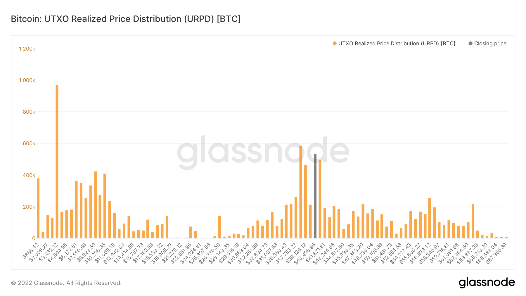
From an on-chain perspective, this is visualized by URPD, which is very similar to traditional volume. The only difference is that this shows you the amount of Bitcoin’s money supply that has LAST moved at each demoniated price level, making it more dynamic. You can see the cluster of volume in this $36k-$45k consolidation, with roughly 20% of Bitcoin’s money supply having moved here.
The spot premium we’ve been talking about for weeks is still persisting, making it longer than the regime that took place during last summer.

Also, (to copy from last week but still relevant): quarterlies have been showing a nice cool off. When I say quarterlies I’m referring to the difference between Bitcoin spot and the price of the 3M futures contract, the basis for what many people have gotten to know as the cash and carry trade. In a way, this is a “risk-free” (aside from counter-party risk) yield for BTC market participants. As you can see in the chart, this basis has generally followed price for the last two years, although didn’t reach nearly as high as it did in late 2021 (18%)as early 2021 (45%). Side note: I doubt it will ever get that high again as the market becomes more efficient -unless- you get exuberance driven by something huge like a central bank or Apple and Amazon announcing they bought Bitcoin. As you can see over the last month or so this has just been trending down, not quite following price. IMO is another signal of lack of exuberance from the derivatives market in addition to open interest and general spot premium to perps.

Another way to visualize this is by comparing Bitcoin price to quarterlies.

Overall, seeing a lack in exuberance from derivatives.
Let’s dive into a few on-chain supply dynamics that I think are worth noting. In pink we have the exchange supply shock ratio, showing you the amount of coins available to be bought on exchanges versus coins not on exchanges. The uptick this week shows a fair amount of coins withdrawn, particularly from Coinbase upon doing some further digging.
Now I know, a lot of people say “Exchange balances don’t matter because people can move coins back onto exchanges in a few minutes.” I don’t fully agree with this but see where these individuals are coming from. With that in mind, we can look at illiquid supply.
This (blue line) tells you the number of coins that are held by on-chain entities that have a statistical history of selling less than 0.25% of the BTC that they take in. So, therefore, by definition, when illiquid supply ticks up it means coins are moving to entities that have a low probability to sell. Does that mean sometimes these entities CAN become liquid entities again? Yes, see May 2021, which was a leading indicator of the impending dump to 30k. But as with ALL forms of analysis, everything is based on probabilities.

Checkmate from Glassnode and David Puell from Ark Invest created this metric this week, LTH Inflation/Deflation Ratio. It takes a concept we’ve talked about often in the newsletter, short and long term holder supply; and compares it to Bitcoin’s issuance. This shows when long term holders supply is increasing, outpacing the rate of supply growth for BTC.
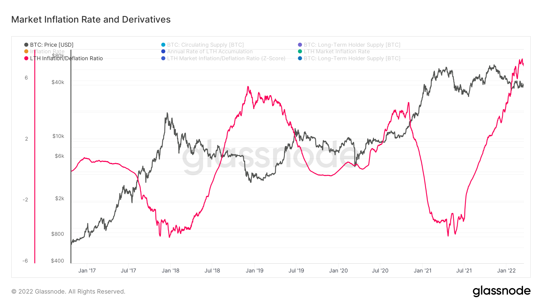
I took this methodology and used supply that hasn’t moved in at least a year instead of long term holder supply to create the metric below:

Ultimately, to regain momentum I still look to short-term holder realized price (or cost basis) as the level that BTC needs to reclaim to regain momentum. This was the level we flipped cautious below which was at 53k at the time when BTC broke below. Currently sits right around $46k.

Mining

Another Downward Difficulty Adjustment
Yesterday afternoon, Bitcoin had its second consecutive downward difficulty adjustment in a row. While it’s impossible to determine exactly why difficulty is decreasing, and there is a small amount of random chance in the short term, it’s possible this downward adjustment can be partially attributed to Kazakhstan confiscating nearly $200M in mining equipment from unregistered miners, as reported by The Block.
This is yet another example that highlights the importance of setting up mining operations in a stable political jurisdiction. If you decided to place rigs in Kazakstan, you’re at the mercy of your foreign unknown hosting operator not cutting corners and following all local regulations. On top of that, countries like Kazakstan and China can change mining regulations overnight, making your mining operation obsolete with little notice. This could cause you to miss out on mining rewards for a significant amount of time, and you may even potentially lose the machines themselves.
The last time two consecutive downward adjustments occurred was July 2021 because of the China mining ban. Looking at the year-to-date chart of Bitcoin network difficulty, you can see the past two adjustments were nothing too significant, as you might expect. With that said, as a miner, it is nice to catch a temporary break.

Zooming out, the trend of difficulty is up and to the right, just like the price of Bitcoin. Interestingly, since the beginning of 2020, network difficulty has only doubled while the price of Bitcoin has nearly 6x’d from $7,000.

While this can be attributed partly to the halving and China mining ban, it shows that price so far this decade has grown faster than difficulty. Hashprice has increased from ~ $0.15 to ~ $0.19 today. This means the same machine that you had running at the beginning of 2020 is actually generating more USD today than it was then. If you locked in your hosting contract or electricity rate, your machine is now even more profitable too.

Bitcoin’s Algorithmic Supply Schedule 🤝 Difficulty Adjustments

Bitcoin is the only asset in the world with an immutable predictable supply schedule. How is this possible? It works because of the difficulty adjustment (discussed above). As more (or sometimes less) hash rate joins the network, the difficulty algorithmically adjusts in order to keep new blocks being mined about every 10 minutes. As new blocks get mined and full nodes validate these new blocks, the immutable supply schedule slowly issues new BTC over time.
In the long run, there will never be more than 21,000,000 BTC. For every other commodity, as the price moves higher, production increases which inevitably pushes the price lower.
No matter how high the price of Bitcoin goes, you cannot increase production. Instead, the difficulty simply adjusts higher.
Only 21,000,000 BTC forever.
This becomes even more apparent when you compare the future supply of Bitcoin with other monetary tools like Gold and USD.

When you adjust the supply of gold and USD with the total supply of BTC at the start of 2020, you can clearly how both the supply of gold and USD will continue to increase faster than BTC forever. This is assuming historical growth rates of M2 - USD (7.5%) and gold (2%).