Blockware Intelligence Newsletter: Week 27
Bitcoin on-chain analysis, mining analysis, equity-analysis; overview of 2/18/22-2/25/22
Summary:
Oil prices have been on the rise. This can be explained through the basic macroeconomic supply and demand graph.
Strong price action in technology/growth stocks on Thursday looks to have paved the way for a bounce, at least for now.
Still in prolonged spot premium over perps
Decent open interest wipe after yesterday’s short squeeze
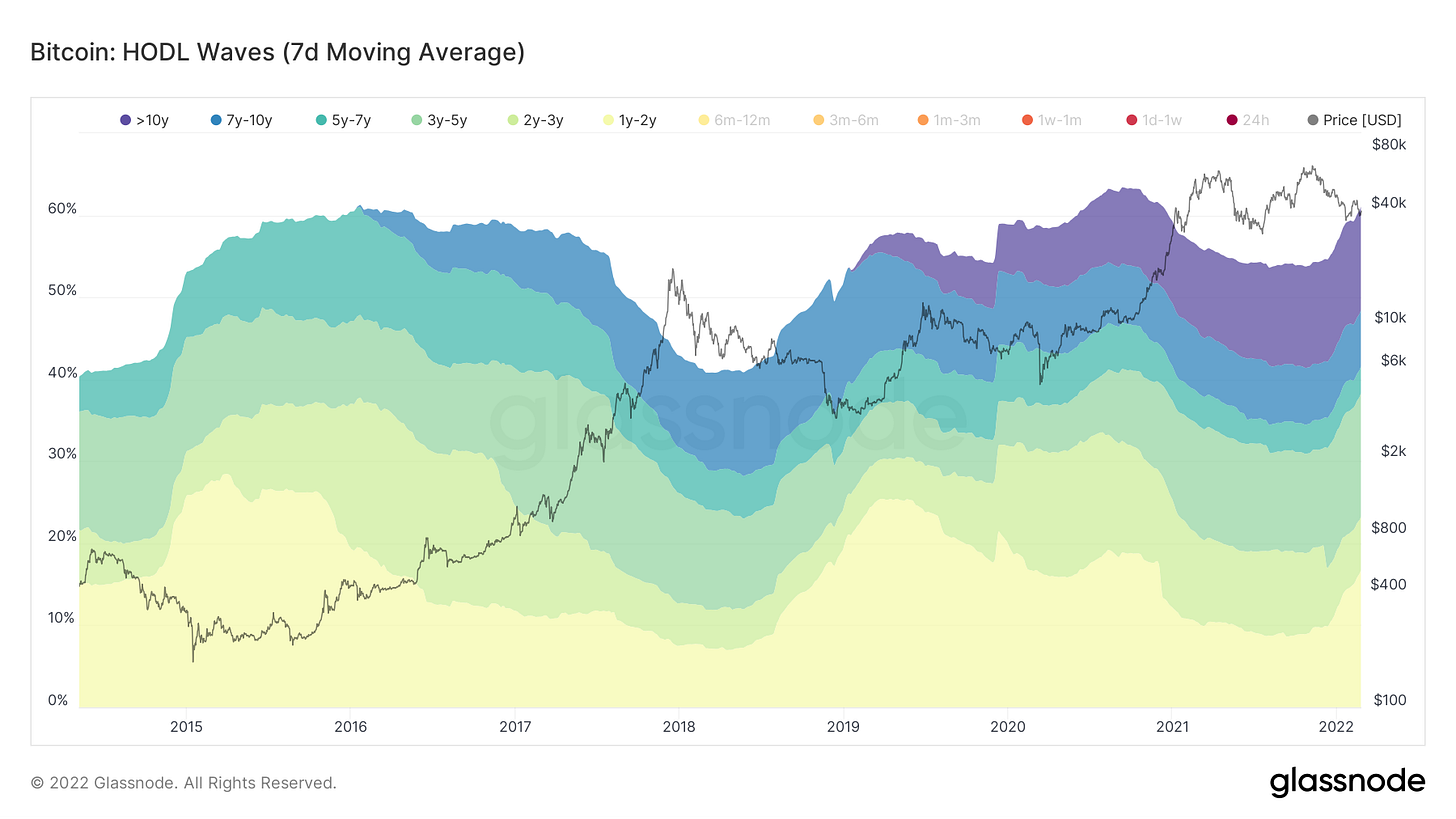
A record 76.5% of supply hasn’t moved in at least 6 months, 76% of supply is held by entities with low tendency to sell
Still stand on our thesis that these levels are a good area for the long term investor, as asymmetric profile in many oscillators is skewed to upside and are in lower 25% percentile
Network activity still relatively muted by several measures
The market is showing signs of fear, but nothing exceptionally extreme.
Set up your Bitcoin mining operation in a stable political jurisdiction.
Bitmain is still the dominant Bitcoin ASIC manufacturer after looking at Intel’s rumored specs.
General Market Update
For the most part, this week has been a brutal one across most sectors in the general market. Of course, this stems from the Russian invasion of Ukraine.
I won’t pretend to be a geopolitical expert but there are clearly a few areas of the markets that tend to see higher prices due to conflict.
Last week I discussed the narrative of why gold tends to outperform in times of war. If you missed it, the basic premise is that massive government spending causes fiat currency to weaken which is why investors flock to gold.
Of course, we all know that investors should instead turn to Bitcoin. But the fact of the matter is that BTC is still grouped by institutions with risk assets like tech stocks. One day this narrative will likely change, but for now, it isn’t the case.
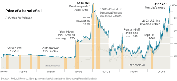
As I’m sure most of you know, the market for oil has been another area of the market seeing increased prices in the recent weeks.
The reasons why oil prices increase during a war aren’t quite as black and white as the gold narrative. A lot of it depends on the countries involved in the conflict. But above you can see how the price of oil behaved during the major conflicts of the last 70 years.
For those of you who are active Twitter users, I’m sure you’ve heard a ton of talk about oil this week. But you may still be confused about exactly WHY oil prices are increasing.
In short, it’s because of the basic laws of supply and demand. Russia is the 3rd biggest producer of oil in the world, and the largest supplier of European oil, producing roughly 36% of the oil for the EU.
The sanctions currently being imposed upon Russia stand to disrupt the economy in numerous ways. Acts of war, combined with economic sanctions, stand to disrupt both Russia’s ability to supply the world with oil and also the payment system in place to fund oil exports.
The effect of a decreased supply can easily be shown on the basic macroeconomic supply and demand graph.
For those who haven’t studied economics, the graph above shows the relationship between supply and demand. Where the two lines intersect shows the equilibrium price and quantity.
A decrease in the oil supply will cause the supply curve to shift to the left.
Demand for oil will stay the same. If anything, it may increase as these countries need oil to mobilize and transport troops and operate armored vehicles and airplanes.
As you can see on the vertical axis on the chart above, this causes the price of oil to increase. As there are the same amount of (or even more) people across the world competing for even less oil.
That being said, the United States, the world’s largest oil producer, has promised to release barrels from its reserves. Whether this will be enough to replace the oil stuck in Russia, we will see.
Following yesterday’s remarks from President Biden, it appeared that some confidence returned to the markets, with oil and gold being sold heavily while the rest of the market caught a bid.
But this is just the basic rundown of why we’ve seen oil appreciate this week. As I said, I’m no expert on the geopolitical and global-macro situation in eastern Europe so let's move on to what really matters to investors, how prices are reacting to this news.
On Wednesday, the Nasdaq undercut the previous lows from January 24th. This means that this rally attempt, following the January 31st follow-through day, is officially dead.
If the market bottomed yesterday, Friday will be day 1 of the rally attempt. If by day 4 (Wednesday) we have a day on any index where the price is up >1.5% on volume greater than the previous day, then we declare a new follow-through day.
This is still an extremely dangerous time to have money in the market and Thursday, the Nasdaq briefly crossed into bear market territory, classified by the index being >20% from its highs.
But many areas of the market, including the indexes, acted very well in the later hours of Thursday’s session.
Both the Nasdaq and S&P put in what we call an oops reversal. Sometimes the sign of a bottom, an oops reversal happens when a stock gaps below the previous day’s low, and then reverses to close higher than the prior day’s low.
Nasdaq Composite 1D (Tradingview)
This is a sign of a mistake among many market participants. The market gapped lower as heavy sellers enter the tape in pre-market and it’s likely that many people had stop losses placed at that previous day’s low.
When the market opens up and takes out everyone stops (automatically sells their positions) and then starts to reverse higher, these people realize their mistake and add to the buying pressure.
It is also very possible that the Russian invasion has become a sell the rumor, buy the news event. The market appears to have been pricing in war for a couple of weeks now. Fear is high and it would make sense to me that all who would sell because of Russian news probably already have.
There are a few data points we can look at to easily gauge the level of fear in the market. This most common of which uses the S&P’s volatility index, known as the VIX.
VIX 1D (Tradingview)
The VIX is calculated by measuring the forward-looking expected volatility of derivatives contracts for the S&P 500. Therefore we know that when the VIX is spiking, price action in the S&P is extremely volatile.
Furthermore, the VIX is often referred to as the fear index. Assuming that most market participants are at least somewhat risk-averse, a rise in the implied volatility of an index should generate some level of fear of lower prices.
Therefore, the VIX spikes at the bottom, showing that volatility and fear is at their greatest when the market bottoms. It looks to me like the VIX has some room to run higher here before I’d be too confident in the final bottom is in. Yet it looks to me like we’re due for a bounce here in index prices.
Another indicator we can use to measure fear in the market is the put/call ratio. Below is the CBOE’s equity-only put/call ratio I pulled off Ycharts.
A high put/call ratio indicates that more of the volume in the CBOE is exchanging puts rather than calls. Therefore, a high put/call ratio would indicate high levels of fear in the market.
Currently, the equity put/call is at 0.67 which is a relatively high number, but like the VIX, it’s nothing too extreme and still has room for more fear. It could very well be high enough for us to form a bottom here but I wouldn’t be too confident yet.
It looks to me like there is, without a doubt, significant fear in the market but selling appears to be methodical, not panicked.
Another market indicator that has been behaving interestingly recently is the 10-day moving averages of up and down volume.
This indicator takes an average of the volume on the Nasdaq on days when the price is increasing and compares it to days when the price is declining.
This gives us an insight into what institutions are doing with their capital. When up volume (blue line above) is greater down the volume (pink line above) we can say that the funds are net buyers with the majority of volume entering long.
As you can see in the circled area above, that up volume moving average spiked heavily yesterday as tons of capital flowed into the market to go long stocks.
It looks to me like institutions are confident that this conflict will be contained to Ukraine and the sanctions imposed on Russia, and the response of major world powers to try to keep oil’s supply stagnant, won’t cause too much harm to the greater world economy. But I’m just speculating.
This is still a dangerous time to be in the market as price action is essentially just news driven at this point. Business news sources are choosing to ignore the sketchy state of the Fed with inflation on the rise.
Headline risk is a big deal in a market like this. Are you willing to bet your portfolio on the hope that there will be positive news this weekend?
Crypto-Exposed Equities
Thursday we saw some nice bounces in the quite oversold crypto stocks. With the major market indexes potentially putting in a bottom (at least for now) it makes sense that capital might begin to flow back into crypto and its related equities.
The correlation between the S&P and Bitcoin is on the rise once again. The correlation coefficient currently sits at 0.91 for SPX to BTC (91% correlated).
Some other news in this neck of the woods was the Coinbase Q4 2021 earnings which were reported yesterday before the bell. Spoiler alert, they crushed it.
Revenues were up 102% from just the third quarter of 2021 and over 400% from Q4 of 2020.
Trading volume on their platform was up over 67% from Q3 and almost 515% from Q4 2020.
They added 4 million new users to the platform in the 4th quarter, a 54% increase from Q3 and a 307% increase from Q4 2020.
It was a very strong quarter for COIN but surprisingly the stock didn’t get too much love yesterday, only up about 4% compared to the many other names in the industry group being up 10%+.
Here is the weekly excel sheet covering the price performance of this group of crypto-related equities this week.
Note that I’ve calculated this week’s return through Thursday’s close. I’ve also only compared Monday’s open to Thursday’s close to calculate the weekly return so that we can see solely this week’s price action and not last week’s close.
On-Chain and Derivatives
Derivatives:
As a backdrop for market conditions, think it is crucial to understand the current regime of the delta between perpetual futures and spot BTC. Prolonged regimes of spot premium paired with trends towards further spot premium almost always lead to short-term price reversion for Bitcoin. As we’ve discussed for the last 2-3 weeks, Bitcoin has been in a prolonged regime of spot premium, now going on 85 days compared to the 88-day long regime of last summer. On top of that, over the last week have seen that spot premium push further, especially during the announcement of the Russian invasion into Ukraine Wednesday night EST. So far today another spot premium print despite the mean reversion following yesterday’s short squeeze.
Speaking of spot, here’s something myself and a handful of others have been talking about a lot the last few days on Twitter: the wall of Bitfinex bids. A chunk of BTC bids was placed on Bitfinex spot order books 3 days ago, the notional value of which was approximately $125M. What you want to see with these bid walls is partial fill, followed by a price move upwards with shallow dips and those bids getting filled. Historically, when these bid walls fully fill it has actually been bearish, and when ask walls have been fully filled it has actually been bullish. Why? Price moves because of effort (active market orders) and absorption (limit orders). When these walls are broken it indicates effort is stronger than absorption. What you want to see is partial fill, indicating absorption of the effort exerted, in this case selling. This was indeed what occurred this time, with the spot bids partially filling, followed by a swift move up off the lows.
Many of the late shorts that piled in at the lows amidst the Russia panic got squeezed yesterday noon following President Biden’s speech, wiping out a fair bit of open interest. Curious to see if we see a further squeeze upon breaking the key level of $40.7, but this open interest has been quite strange, as we’ve seen a slow bleed out over the last 2 months compared to the traditional flush out BTC loves to do. As said in previous letters, overall think this build-up has been passive hedging.
On-Chain Supply Dynamics:
In regard to supply dynamics, one of the main indications of strong holding behavior is HODL waves; measuring the amount of BTC supply that has not moved in each denominated cohort of time. Currently, 76.5% of Bitcoin’s supply hasn’t moved in at least 6 months, an all-time high.
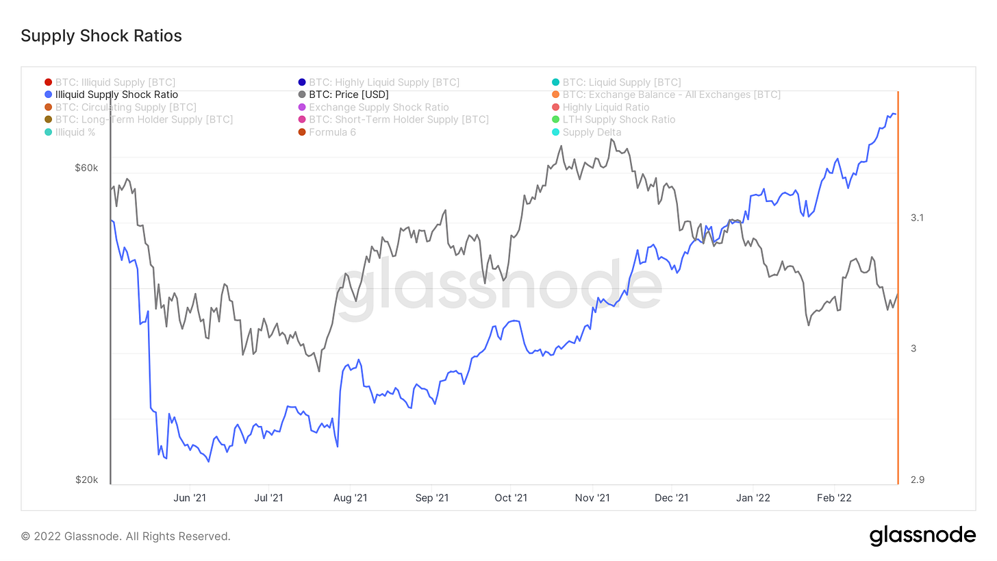
Illiquid supply continues to climb, indicating a flow of supply to entities who hold over 75% of the coins they take in, or conversely sell less than 25% of the coins they take in.
76% of supply is currently “illiquid”.
This week I created what I’m calling the “Dry Powder Ratio” comparing the value of stablecoins on exchanges to Bitcon’s market cap. Major increases in this have marked bottoms as dry powder (capital waiting to be deployed) steps into the market.
Next we look at supply delta, created by Charles Edwards from Capriole Investments. This normalizes long and short-term holder supply and visualizes key pivot points in their behaviors.
Last, we look at dormancy flow, a chart we’ve been talking about for a few weeks. This shows that the spending from older coins is lower than the 365-day trend. This is another indication that for investors with broader time horizons, these price levels are likely good to dollar cost average into, a concept we looked into with more depth in last week’s letter.
On-Chain Activity:
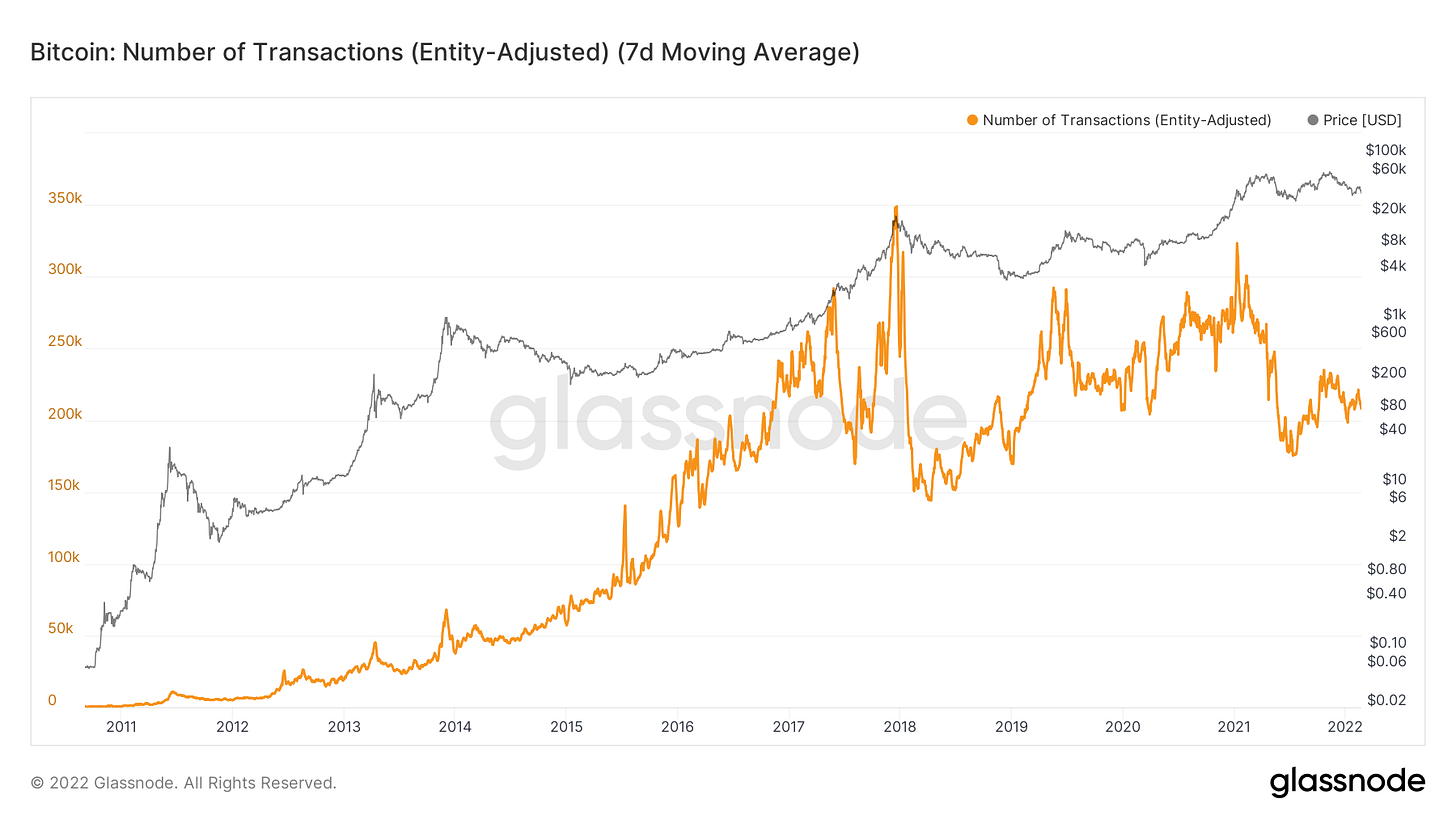
Overall on-chain activity remains pretty muted. We’ll look at a few things to illustrate this. First we have active address with a 7-day moving average applied, showing after April 2021, exuberance in Bitcoin never reached the same levels.
Very similar signature in the number of entity adjusted transactions.
Lastly, confluence with the amount of transfer volume coming from transactions with a USD value of less than $100K. Another indication of lack of retail interest in BTC following April 2021.
Mining
Intel’s 1st Generation Bitcoin ASIC
Intel recently announced the details of their first-generation Bitcoin ASIC (Bonanza Mine chip). The specs of this chip are fairly disappointing and not very competitive compared to the new generation Bitmain models. However, Intel still hasn’t officially announced the details of its second-generation Bitcoin ASIC, which is the chip that mining companies like GRIID have a supply agreement for.
According to Intel’s slide deck from a conference earlier this year, their first-generation ASIC operates a hash rate of 40 TH/s at 3600 W. This is an efficiency of 90 J/TH.
https://www.tomshardware.com/news/intel-details-its-bitcoin-mining-bonanza-mine-chips-and-systems
But what does that mean? On an efficiency basis, Intel’s first-generation chip is only marginally better than Bitmain’s S9, which was released back in 2016. So this first-generation chip is not competitive, but it will be interesting to learn more about their second-generation ASIC as that information is released.
Intel’s 2nd Generation Bitcoin ASIC?
While Intel has yet to officially release specs on their next-generation Bitcoin ASIC, we can try to tie GRIID’s investor presentation (published on sec.gov) to Intel’s new chip shipping out to clients later this year. GRIID has signed a public supply agreement with Intel, but that specific agreement didn’t include machine specs of their 2nd generation ASIC. This generic presentation is the only possible hint of what the specs of the 2nd gen ASIC could be.
Presentation link (slide 15): https://www.sec.gov/Archives/edgar/data/1830029/000119312521342985/d236832dex992.htm
As the presentation states, this “New Miner” will have a hash rate of 135 TH/s and an efficiency of 26 J/TH. This would be a significant improvement from the specs of their first-generation Bitcoin ASIC, but it is still less efficient than Bitmain’s S19XP model, which is also being released this year. The XP has an efficiency of 21.5 J/TH.
It will be interesting to learn more about Intel’s new Bitcoin ASIC, and as soon as we have more data, it will be included in the Blockware Intelligence newsletter. As of now, Bitmain remains the clear dominant leader in the Bitcoin ASIC industry.
Mining Bitcoin in a Stable Political Jurisdiction
As noted at the top of the newsletter, the Russia Ukraine conflict has significantly affected markets, but it also highlights the importance of setting up mining operations in a stable political jurisdiction.
When China banned Bitcoin mining in 2021, all miners had to immediately shut down their operations or risk operating illegally under the CCP. These miners had to relocate or liquidate their rigs to anyone that would buy them outside of China. Mining operations there were completely dismantled.
This conflict with Russia and Ukraine is yet another instance of why you need to be very meticulous about where you set up your mining operations. If you have ASICs deployed in either country your machines are currently at high risk.
This is a key reason why Blockware Solutions has focused on hosting clients in the United States, the most stable political jurisdiction for Bitcoin mining in the world.









👍Good job Will, love the "Dry Powder Ratio"
A little bit confused though. During the May crash into the summer of 2021, "Dry Powder Ratio" kept increasing, yet illiquid supply was trending downwards.
Here's my thesis, correct me if am wrong.
Folks were selling and converting into stables, not necessarily withdrawing out of exchanges. Only when there was a divergence between price and illiquid supply, then a decline in dry powder did price start trending upwards.
From the charts, rising stables on exchanges has sent prices lower, and vice versa.
Maybe we could get a metric, to make up for the "gray area" as we don't know if stables on exchanges are folks selling (converting to stables) or dry powder ready to be deployed (depositing into exchanges).
Let's say you combine Illiquid supply + Dry Powder Ratio.
- Where declining Illiquid supply and rising Dry Powder Ratio means folks are selling (converting into stables)
- Rising Illiquid supply and rising Dry Powder Ratio (are dry powder ready to be deployed).
- Rising Illiquid and falling Dry Powder Ratio (dry powder has been deployed).
Would love to see this metric. Thanks.
Take it easy man.
"A record 76.5% of supply hasn’t moved in at least 6 months, 76% of supply is held by entities with low tendency to sell"
God, I love Bitcoin!