Blockware Intelligence Newsletter: Week 2
In-depth look into Bitcoin market trends from the week of 8/12-8/19
Dear readers,
Hope all is well and you had a great week. It’s been another choppy week of trading for Bitcoin as uncertainty from Afghanistan, possible tapering on the horizon, and a rallying dollar has spooked markets. At the same time Wells Fargo and JPMorgan have announced the launch of Bitcoin funds in partnership with NYDIG, and Coinbase has announced their decision to convert 10% of their profit to crypto holdings. Let’s dive into some of the on-chain factors that are worth noting from this week.
Key takeaways:
- Hash slowly continues to come back on the network, Miner profitability fizzling after a big increase following the record difficulty adjustment last month
- Realized cap reaches new all-time highs
- $20B of stablecoins still sit on exchanges
- Supply liquidity continues to dry up, while exchange flows are flat this week
- Market has stabilized in a state of profit
- Leverage ratio, OI/Market cap, & Funding all still relatively healthy
- Transactional usage starting to pick back up
- Still no red flags in terms of LTHs taking exit liquidity, aside from some 2-3 year old UTXOs moved Tuesday
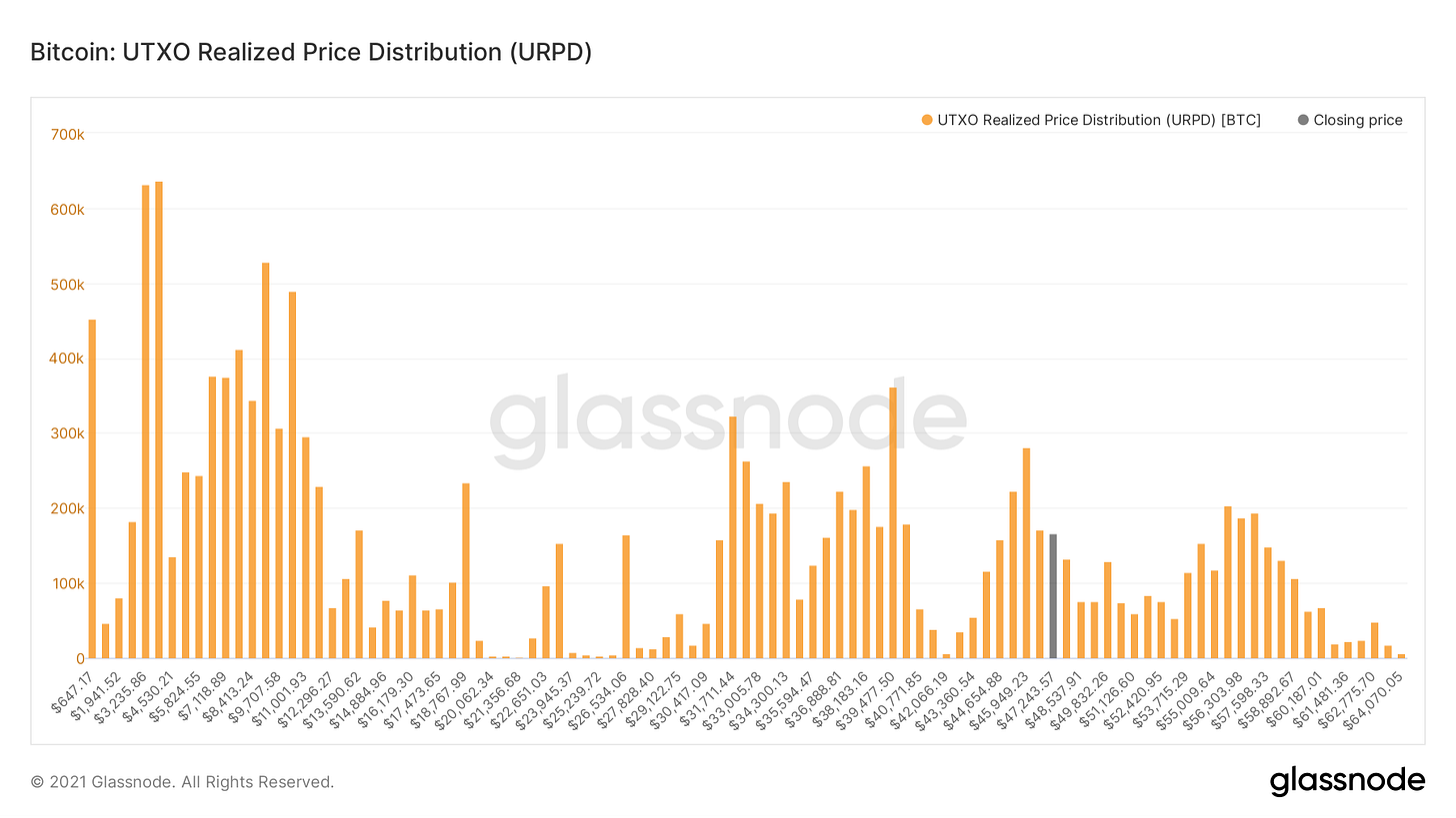
Bitcoin currently sits above a large amount of on-chain volume both between the $30K-$40K range and some in the mid-40s. This metric shows how much of Bitcoin’s money supply has moved at different price levels. These zones of volume can inadvertently be used as support/resistance levels because large amounts of supply were transacted there. The final zone of volume Bitcoin needs to clear to the upside is between $56K and $59K.
After the massive drop in hash rate as China miners migrated and the record difficulty adjustment that followed, the miners still securing the Bitcoin network became extremely profitable. This is shown by the green line, BTC revenue/Hash. As hash slowly comes back online, this profitability is fizzling out, but is still significantly higher than before.
This increase in profitability has allowed these miners to reduce their sell pressure on the market as they no longer need to sell as much BTC to cover their operational costs.
Another metric related to miners, market cap to thermocap, is starting to move back up. This measures Bitcoin market cap in comparison to the aggregate security spend of miners. Comparing the two allows you to identify areas where the market is considered over-heated or under-heated relative to miner security spend. Note, this ratio never reached a historical zone of being considered overheated.
Next up we have realized cap, which has reached new all-time highs this week. This is the capitalization of Bitcoin based not off the current marginal price bid and then multiplying that by current circulating supply, but rather uses the time coins were last moved. For example: I bought $100,000 of BTC at $1 and never move them. Those coins make up ~$4.7B of market cap, but still only $100,000 to realized cap because that’s what they were worth when they last moved. Another way to think of this for technical traders is that realized cap is an on-chain VWAP. This reaching new all-time highs shows that coins are no longer being sold at a loss and there are strong capital inflows.
Taking realized cap a step further, we have David Puell’s MVRV; a comparison of market cap to realized cap. We’re looking at the z-scored version here, which adjusts MVRV for volatility and gives sharper signals for market tops while also still giving great buy zones in the bear market. When market cap is below realized cap the market is in capitulation by definition. This measures the premium the marginal spot bid is pricing Bitcoin against the average weighted price that investors have paid for their coins. This metric is starting to recover similar to mid-2013, also note we barely reached a historical over-heated zone earlier this year.
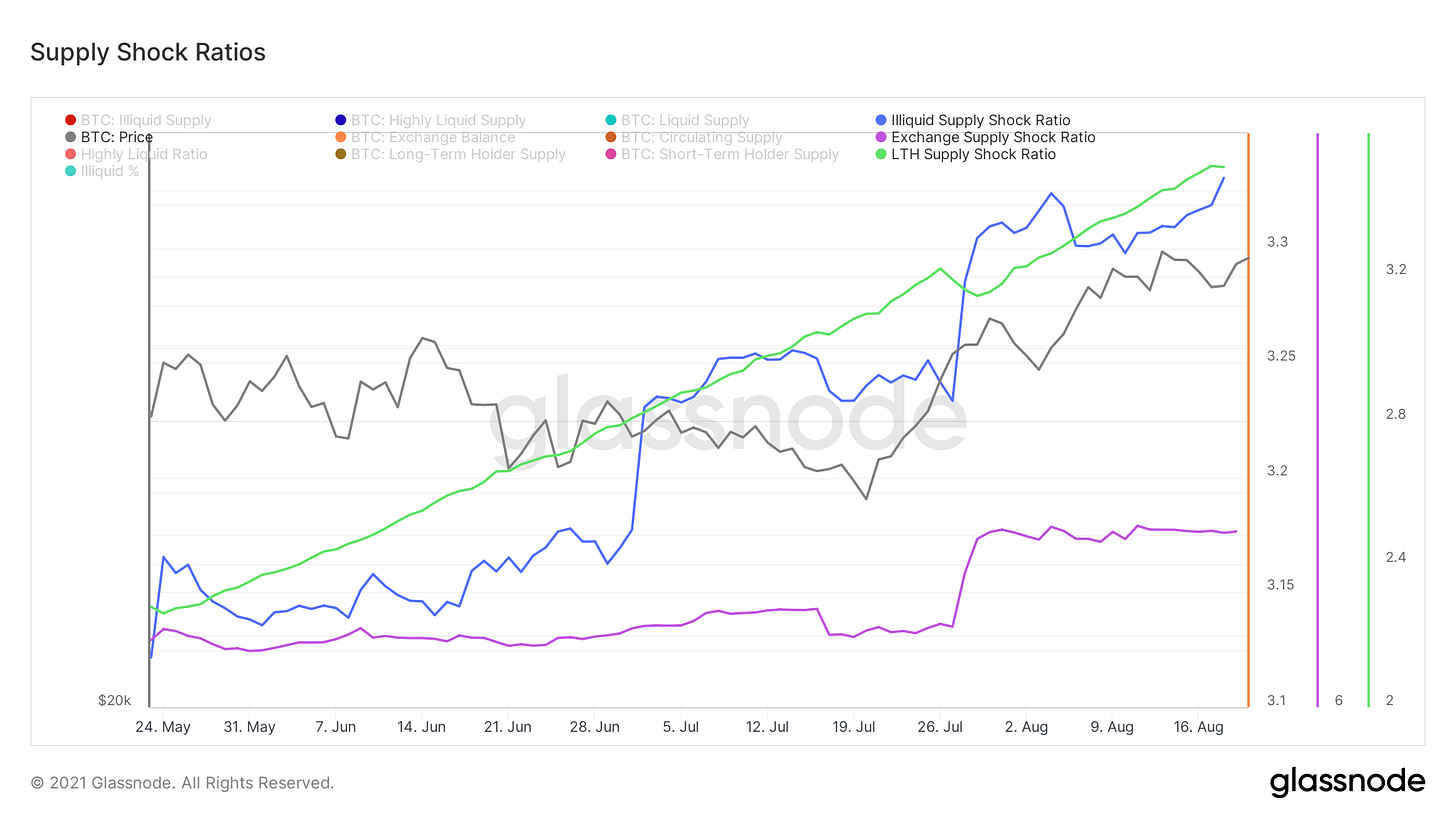
Next up we have our supply related ratios: Illiquid Supply Shock Ratio, Exchange Supply Shock Ratio and LTH Supply Shock Ratio. Supply continues to move to “strong hands” shown qualitatively by illiquid supply and long-term holder supply; however exchange flows are neutral/sideways.
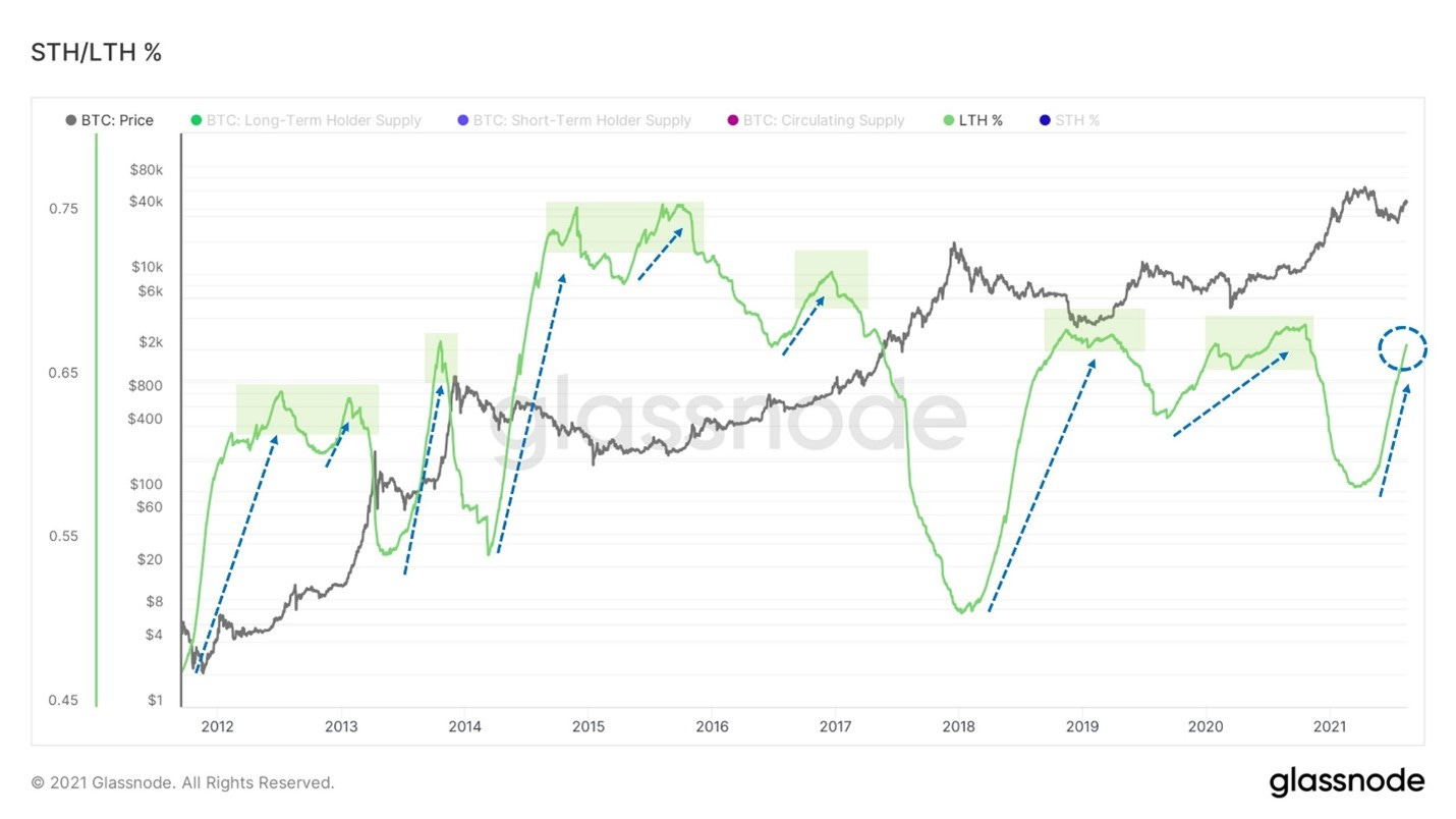
Zooming out looking at long-term holder supply as a percentage of overall circulating supply, what you see is that long-term holders set the floor. These entities distribute into the bull market and accumulate into the depths of the bear market until a supply squeeze is brought upon the market. Currently this continues to move up aggressively; only other times that resemble this are after both 2013/2017 bull runs and mid-2013. What’s really intriguing here is the rate of which this is currently increasing.
We touched on Illiquid Supply Shock ratio in depth last week so I won’t reiterate, but wanted to show the metric from a broader perspective. This current move up resembles nothing like the end of the 2017 bull market/beginning of bear market. At that time a massive amount of supply became liquid, right now the exact opposite is happening. If anything, it looks more like the recovery in late summer 2017.
On a similar note, one thing we’ve been looking for to distinguish this rally from a dead cat bounce is the behavior from long-term holders or experienced market participants. Although there was a spike in movement from some 2-3 year old coins on Tuesday, still nothing of overall concern. As we touched on earlier, long-term holder supply continues to go nearly vertical and nothing looks alarming with average spent output lifespan or dormancy/coin days destroyed aside from a confluent spike with SOAB on Tuesday.
Here we have NUPL, net unrealized profit loss. The parameter of this metric is pretty simple: in euphoric price peaks market participants get complacent and don’t take profits, setting the market up for big capitulations. We’ve bounced off the “hope/fear” zone (never turned orange) similar to mid-2013 into belief/denial. Also note that NUPL never reached a historical “euphoric” zone, market by the blue.
Next is the stablecoin supply ratio, which compares the stablecoin market capitalization to Bitcoin’s capitalization to show how much buying power stables have relative to Bitcoin. When running Bollinger bands over the metric you find an interesting pattern; each time SSR dips below the lower band a macro bottom has been marked. After going below the lower band recently, it looks like stablecoins are starting to flow back into the market.
Another way to look at this is a new metric I’ve created this week, the stablecoin exchange reserve ratio. This compares the amount of stablecoins on exchanges relative to overall supply. The only limitation here is that stablecoins locked up in smart contracts on other protocols haven’t been filtered out. This serves as a decent proxy for how much capital is sitting on the sideline. Multiplying this ratio by overall stablecoin supply shows roughly $20B of stables sitting on exchanges right now.
Now let’s take a look at SOPR, spent output profit ratio. This measures the profit that coins hold on any given day. Here we’re using the adjusted version which filters outputs less than an hour old. The “1” threshold is the pivot point for bear/bull market structure, marked by the black line. We have printed a textbook SOPR reversal, first bouncing off 1 as support during a price drawdown, and now stabilizing above 1. Very positive to see the market trading in a state of profit and absorb profit taking.
Next, let’s take a look at some of the network activity related metrics. Active addresses and the number of transactions on the network are both starting to pick up; showing follow through on this price rally. This is another positive sign and a trend we want to ideally see continue over the coming weeks.
Last but far from least important wanted to briefly touch on derivatives. Futures estimated leverage ratio, shown below, compares futures open interest to the amount of Bitcoin on an exchange to ballpark how collateralized traders are. We are still far from the levels in this ratio that we were back in February with similar price levels. Funding is also far from where it was in February as well. Unless there is an obvious divergence between funding and price, not weighing funding as strongly until there is an increase in open interest as a portion of Bitcoin’s market cap. Overall basic measures of derivatives look healthy.


TOO LEGIT
Thanks!