Blockware Intelligence Newsletter: Week 9
Market taking a breather after a strong rally, what is going on under the hood?
Dear readers,
Hope all is well. This week has been a great start to Q4 for Bitcoin, with prices reaching as high as $56K. Let’s dive into some key trends that you may want to be aware of.
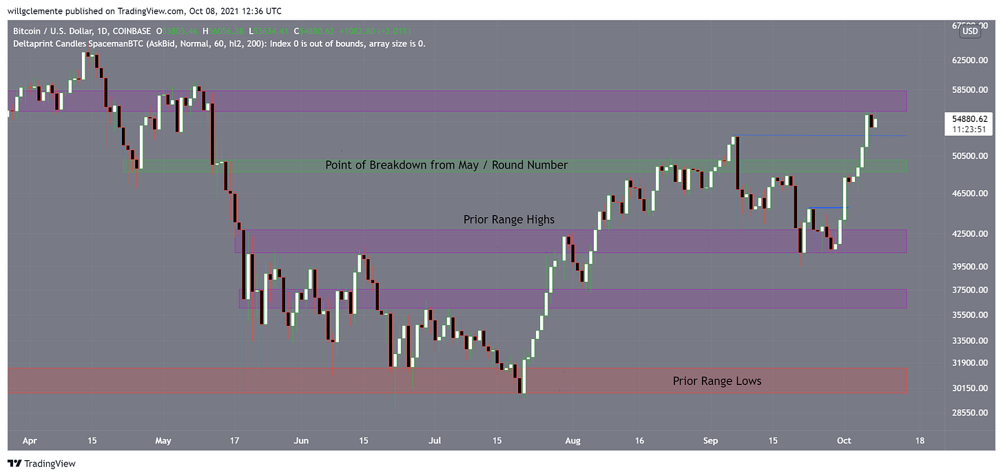
From purely a price structure standpoint, we have broken the key point of breakdown level from May which was around $50K: as long as BTC holds above that PoB I remain strongly bullish. In the short term, we are seeing some resistance from this last $56K-$58K area, which is not unexpected as there is a fair amount of overhead supply there from earlier this year. In addition, perpetual futures funding has shot up aggressively over the last 24 hours. Just something to keep in mind in the short term, would look for $53K as a logical area to buy a dip. (if we get one)
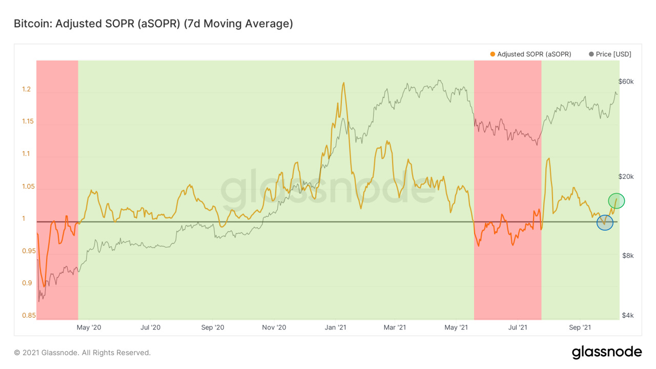
Following up on last week, our good friend SOPR has bounced off 1 and we are now seeing follow through to the upside. SOPR compares the realized value to the value at creation, giving you a proxy for the state of profit that the market is trading. For this specific chart, I use aSOPR (filters for outputs <1hr) with a 7 day moving average to get filtered weekly SOPR. We want to see continuation to the upside (similar to Oct-Nov last year) but stabilization above 1 at a minimum.
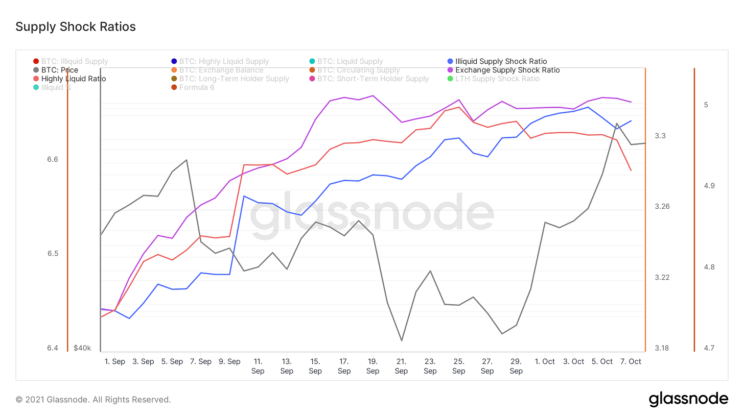
Let’s take a look at our supply shock ratios. Illiquid supply shock ratio continues to grind up showing coins moving to entities with low spending behavior, but we are seeing some coins flow from liquid to highly liquid entities, shown by highly liquid ratio. Exchange flows are flat over the last two weeks, with exchanges down roughly 490 BTC in that time period.
Illiquid supply: Neutral-Bullish
Highly liquid ratio: Short-term slightly bearish
Exchange supply shock ratio: Neutral
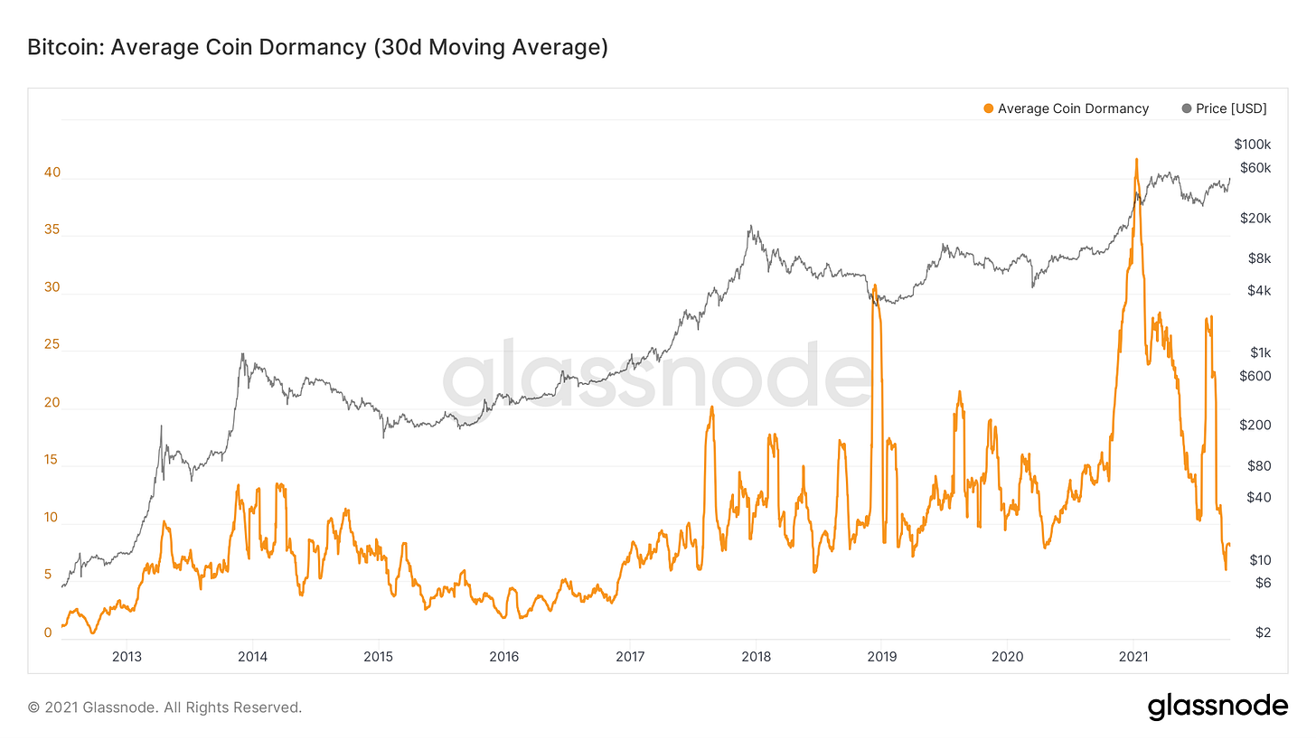
One of the cornerstone concepts in on-chain metrics is Coin Days Destroyed/Destruction. For simplicity purposes, let's say I buy/withdraw 1 BTC to my wallet. I decide to hold it in that wallet for 1 year, that coin has now accumulated 365 coin days. At the end of those 365 days, I send the BTC to an exchange to sell, 365 coin days have now been destroyed. In bull markets, we see high destruction, as old coins are spent into strength. Conversely, in bear markets, we see destruction decrease, as long-term investors accumulate cheap BTC and hold tight to their stash for the next secular bull market.
You can also take this a step further and divide CDD by volume to get an adjusted value of destruction. This is called dormancy. Since January, Dormancy has been on a decline aside from a spike after the move off $30K. This means that the amount of destruction is declining, or old coins are being spent less. The same is reflected by ASOL, SVAB, and SOAB.
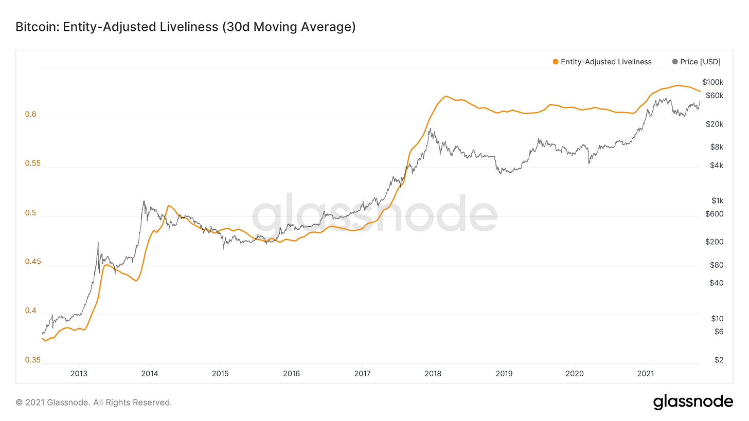
Another methodology is liveliness, which is a ratio of the sum of coin days destroyed and the sum of coin days ever created. In periods of distribution, liveliness increases as the amount of CDD relative to created grows. In periods of accumulation, liveliness decreases. Liveliness has been declining for months now, showing more coin days being created than destroyed.
Note: I use the 30 day moving average of the entity adjusted version here
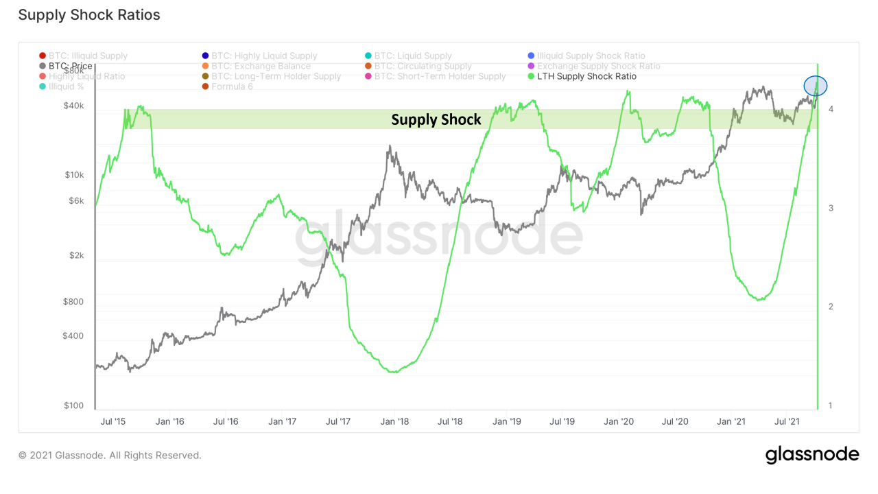
The macro case continues to grow, here’s one of my favorite charts: Long term holder supply shock ratio. The methodology for this metric is that when LTHs lock up a large enough portion of supply there is a supply squeeze effect on the market. The ratio has reached all-time highs, which is extremely bullish. What’s really interesting to me is that when you put this into context, Glassnode uses a 155-day threshold to deem LTHs, so seeing the metric increasing shows that some of the entities who bought their coins in early May (before the drop to $30K) are still holding strong.
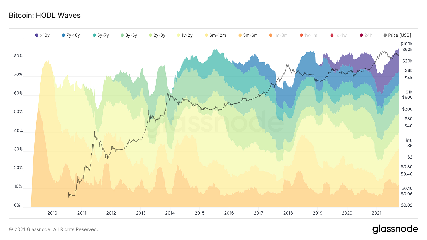
Another way to look at supply dynamics is through HODL Waves. This shows the amount of BTC that hasn’t moved in each denominated time cohort. An all time high, 85.1% of Bitcoin’s supply hasn’t moved in at least 3 months.
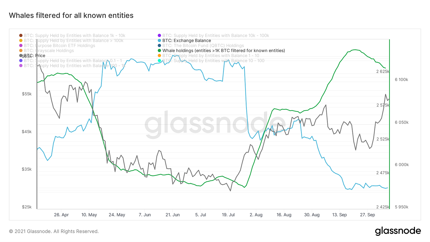
We are seeing some profit-taking from whales, shown by the green line. This is the 14 day moving average of filtering all entities with more than 1,000 for all the known entities we’ve identified on-chain, with exchanges being the most important. It’s not all that surprising to see this after a strong move since summer, but something we can continue to keep an eye on for sure.
Note: General inverse correlation to exchange balances (blue)
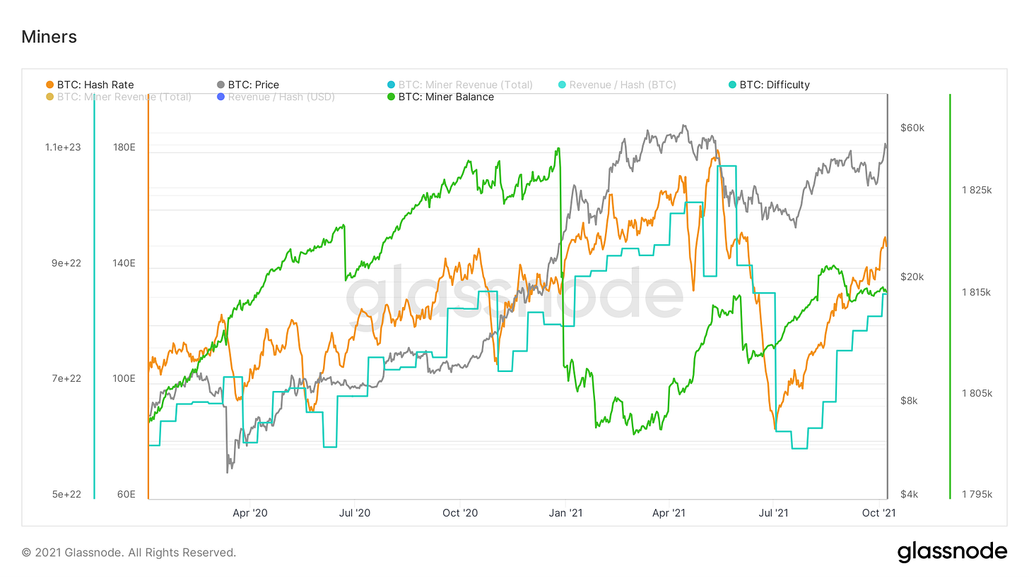
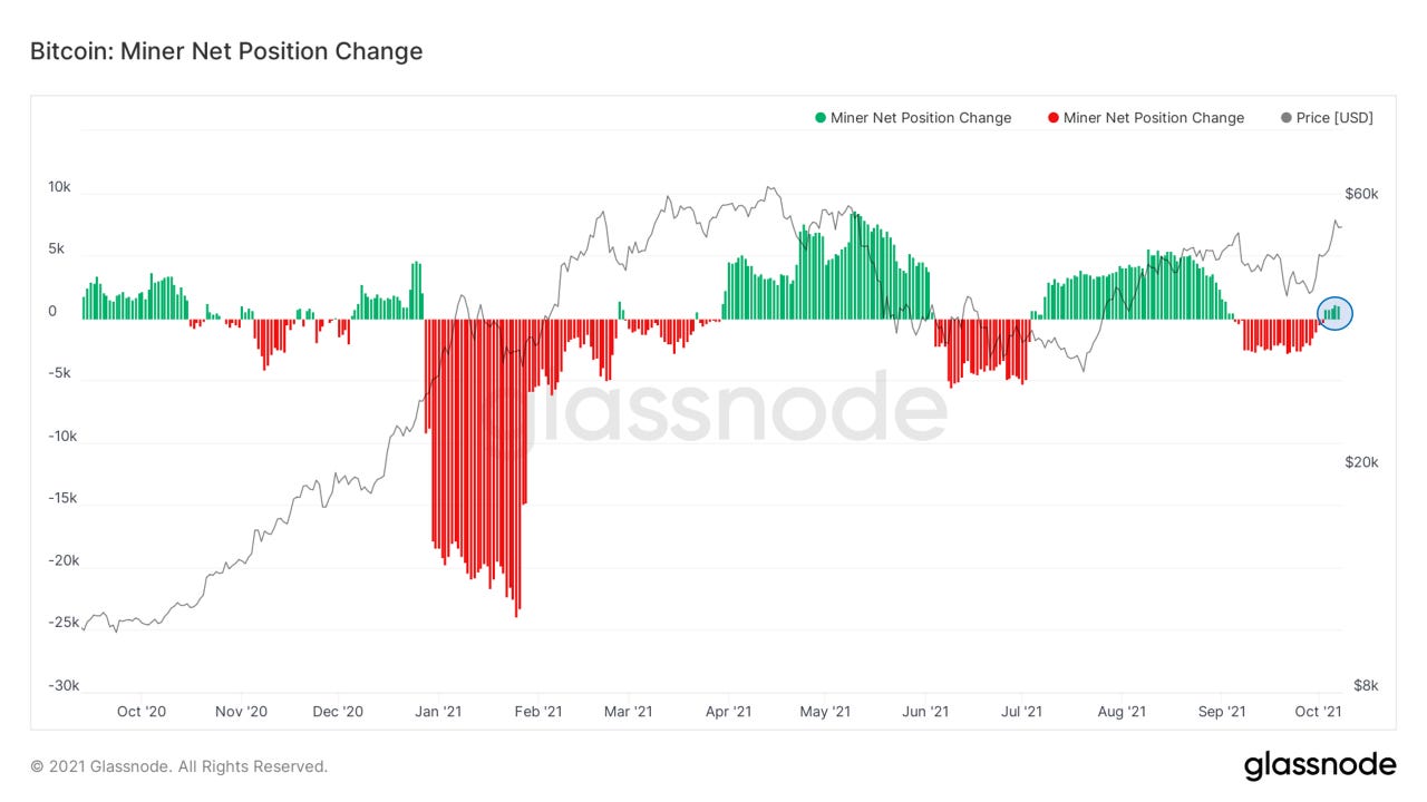
Let’s take a peek at miner activity. we’re seeing hash come back on aggressively, shown by the orange line. With this, we’ve now had 6 straight positive difficulty adjustments. Miners have also begun accumulating again slightly after selling some coins into strength a few weeks ago.
This is reflected also by our miner net position change metric, which looks at the 30D change of miner balances.
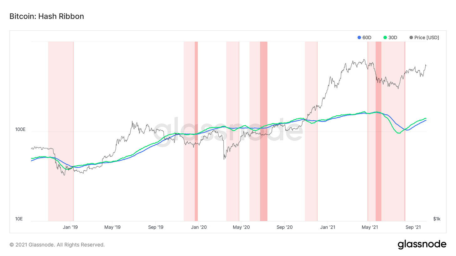
On the note of miner activity, let’s look at Hash Ribbons, created by Charles Edwards. One of the most accurate macro buy signals in Bitcoin, this looks at the 30D and 60D moving averages of hash, to capture the recovery of miner capitulation events.
White to light red: 30D crosses below 60D
Light red to red: 30D crosses above 60D
Red to white: 30D has crossed above 60D + 10-day price SMA is above the 20 day price SMA
Conclusion:
Short-term outlook: Seeing some coins move from liquid to highly liquid entities, exchange flows neutral, some whales taking profits, funding spiking while market cap/OI increasing. Wouldn’t be surprised to see a short-term pullback to around $53K and at the lowest a retest of PoB.
Macro: Highly bullish. Supply dynamics(HODLing behavior) remain strong, hash coming back on the network, retail still out of the market. Still standing on my thesis for a strong Q4.
Bitcoin-related equities (by Blake Davis):
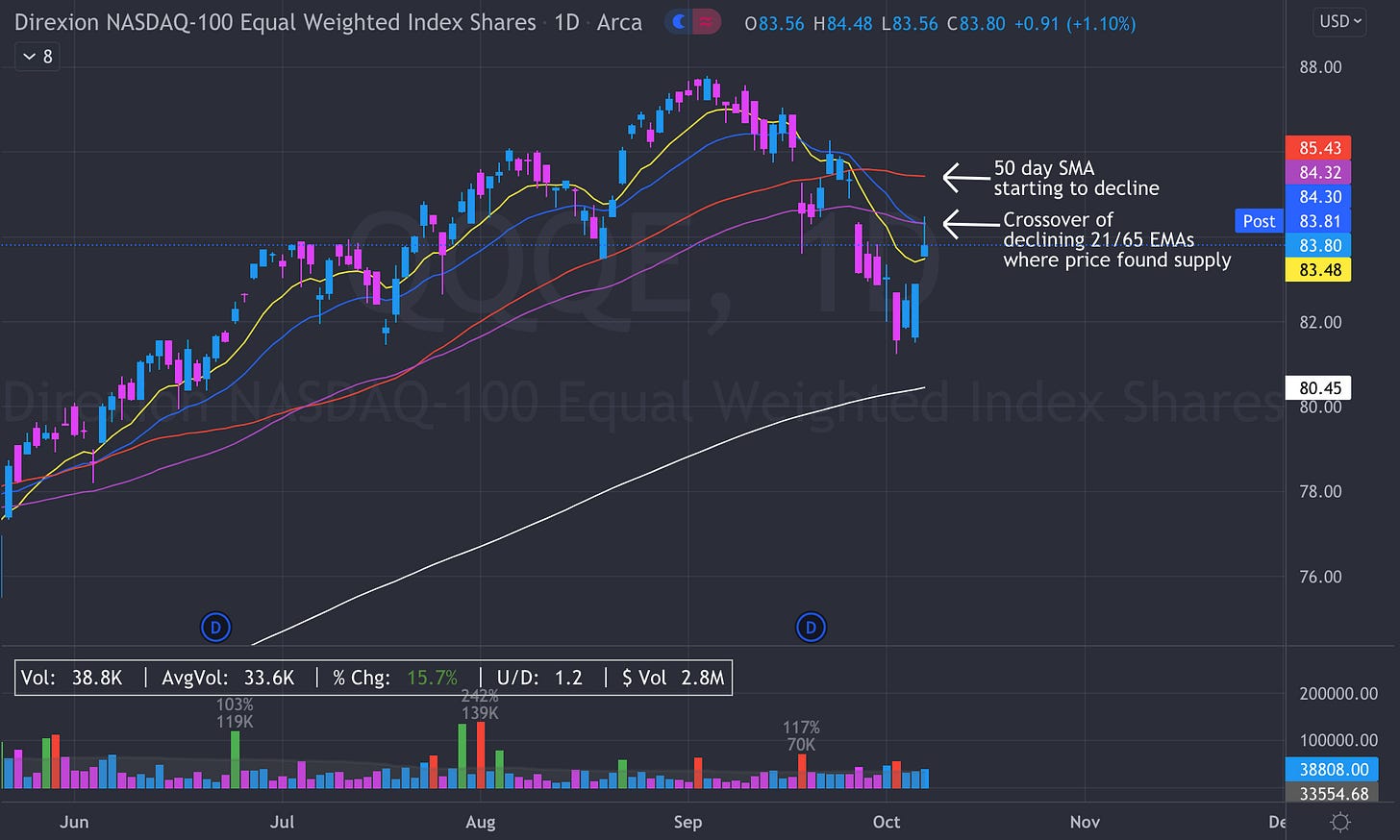
What a crazy week in the world of crypto, tech stocks and the combination of the two. I was a little off on my analysis last week, while it still appears that the market indexes could take some time to recover their losses, I underestimated the speed that power would return to the growth true market leaders (TMLs). We need to keep in mind, however, that there are still some areas on the charts of the market indexes that could potentially become overhead resistance. Price often struggles to get back above a declining moving average when approaching it from underneath.
Below is a chart of QQQE, an equally weighted Nasdaq ETF. Here we can see price entering a gap and nearing some declining longer-term moving averages from the underside. We would like to see price ignore the moving averages and run higher, but historically these often become areas of supply. Thursday on QQE we saw price get above the declining 21 and 65 EMAs for a little bit but it ultimately was sold at this level to form a downside reversal. This week, the 10 year bond yield began to fall and with that, the strongest tech stocks ripped but yields began to tick higher again and as of Thursday’s close are higher than they were last week. This isn’t a big concern of mine at the moment because, so far, stock prices don’t seem to care. The leaders of the tech market are acting well, overtaking moving averages from the underside with little to no resistance. At the moment, investors appear confident in the current state of technology stocks. The weaker names have struggled to regain much ground and are for the most part, near their one month lows. This shows why we try to own the strongest TMLs we can; why buy a Honda if you could get a Ferrari for the same price?
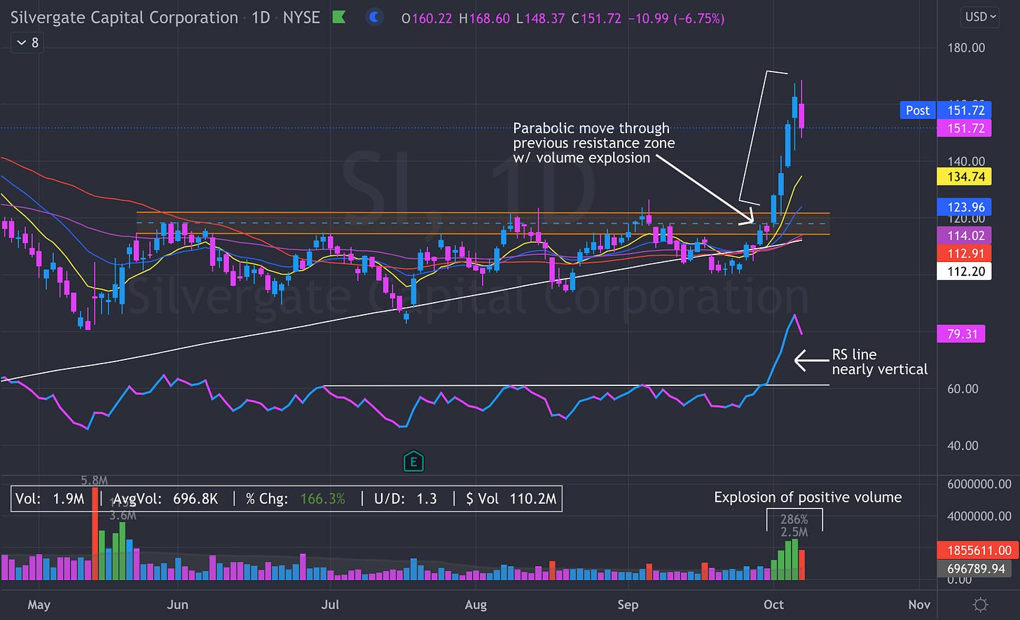
Bitcoin has had a massive week, up almost 14% as of writing on Thursday afternoon. As we discussed two weeks ago, crypto-exposed equities trade on average 1.09x the price of Bitcoin. The stronger names are up even more than that. Last week we broke down the technicals of Silvergate Capital (SI) and I gave a few reasons why I believed this stock had potential to be the next leader. I highly recommend anyone who is interested in learning technical analysis goes back to last week’s edition and studies the chart. SI is so far up over 23% this week and is a clear, must own, leader in the crypto-equity industry group. This isn’t an advertisement to go out and buy SI today. It is now very extended from its previous base and moving averages, buys at these levels are likely to be retested or go underwater. A truly powerful stock, one that’ll run for months, will provide patient investors plenty of opportunities to buy.
Aside from SI, there are plenty of other crypto-exposed equities that are showing strong signs of accumulation. The way I look at it, there are a few distinct tiers of industry leaders. It appears at the moment, SI is in a league of its own. In my opinion, the power rankings behind SI go in the order of:
1. Microstrategy (MSTR)
2. Tesla (TSLA)
3. Marathon Digital (MARA)
4. Coinbase (COIN)
5. Hut 8 Mining (HUT)
6. Advanced Micro Devices (AMD)


Loving the equities information!
nothing but up-and-to-the-right... long live ₿!