Blockware Intelligence Newsletter: Week 12
On-chain analysis, Macro-analysis, Equity-analysis; overview of 10/22/21-10/29/21
Dear readers,
Hope all is well and you had a great week. Following last week’s letter, we saw continued downside, retesting the $56K-$58K range. (The dynamics behind this move will be discussed below.) This previous resistance zone has been flipped to support. (for now)
Let’s dive in. First, we’ll start with the immediate term price action/market dynamics and then zoom out to the bigger picture throughout the letter.
This week we also have a special guest post from Nik Bhatia covering macro, in addition to our usual Bitcoin-related equities section written by Blake Davis. Enjoy!
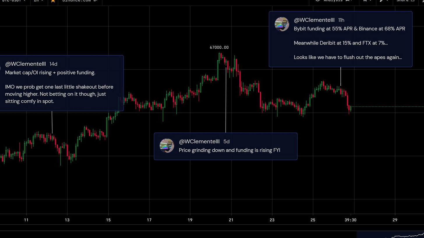
On Wednesday we saw another leverage flush out, with a very similar set up to the one we discussed last week. We saw open interest rising, particularly crypto margined contracts. We also had funding rising as BTC price was decreasing. Pairing those factors with some tight liquidation levels (I like to use Hyblock for that), it wasn’t surprising to see longs get liquidated. Positive funding in itself isn’t always an immediate term bearish sign, as in a trending market that can just be the cost of doing business. Where funding has real signal IMO is when price is diverging from an aggressive move it is making. It’s all about putting it into the context of other factors.
You can also take an even more granular look by comparing funding rates amongst individual exchanges. Another factor that added to my conviction of there being a flush was the fact that more retail-driven exchanges like Bybit and Binance had very high funding (55-70% APR) meanwhile exchanges such as Deribit and FTX had much lower funding.
With the launch of the ProShares Bitcoin Futures ETF ($BITO), we’ve seen CME futures open interest soaring over the last few weeks. CME is now the leading futures exchange, with open interest now over $4.7B; 77,090 in BTC terms.
This must be kept in mind moving forward when looking at measures such as market cap/OI, because the CME is not nearly as levered as exchanges such as Binance or Bybit.
Another very key dynamic in the derivatives market, which I have been trying to push lately is the percent of open interest margined by crypto. This is important because as this metric rises, it means the futures market is prone to more convexity to the downside. If you’re longing Bitcoin with Bitcoin collateral, it’s great when price is rising. But as soon as the market starts to move against you, not only is your PnL declining, but also your margin, leaving your contract less collateralized and you more susceptible to getting liquidated. If short and margined with USD or stablecoins, you also no longer have the inadvertent hedge you do by being margined with BTC/crypto. Seeing this metric continue to decline means less potential convexity on a down move, and higher likelihood of shorts being squeezed.
Next up we have the entity adjusted version of our good old friend SOPR, spent output profit ratio. This looks at the value of all the BTC trading on each given day based on the profit they’re realizing. We got our bullish confirmation last month. Looks like we are starting to tick down again, so now watching to either set a higher low, or at a minimum bounce off 1 again if we retest it to maintain bullish market structure. Nothing to worry about right now.
A few weeks ago we mentioned that whales had been taking profits after accumulating since late July. Over the last 2 weeks we’ve actually started to see them accumulate again. The green line looks at all the entities Glassnode has identified on-chain with more than 1,000 BTC, filters out known entities such as exchanges, and then applies a 14 day moving average to filter out any noise in the labelling algorithms. Note that this is still not perfect, as it relies on Glassnode’s entities heuristics, so I would take the actual values with a grain of salt; but I do still find the general trend useful.
In addition minnows (blue line) have been stacking, as always. Zooming out, minnow’s holdings are just up and to the right throughout all of Bitcoin’s history; showing the relentless belief in the asset from retailers DCAing around the world.

Now on to the macro picture. I can only include 2 charts because of email limits, but on Wednesday I put out a 22 tweet thread on this; so if you want a more in depth analysis feel free to check that out.
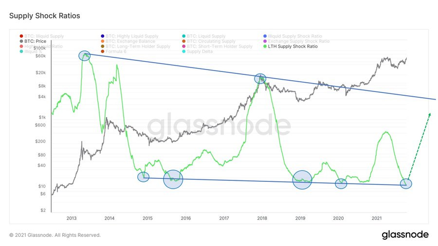
First we have the long term holder supply shock ratio, which we’ve looked at several times here before. This compares the amount of supply in possession of short term holders versus long term holders. Below I inversed the chart and drew trendlines over the metric. I think trendlines are just as valid in on-chain analysis as they are in technical analysis, because at the end of the day we’re all just visualizing human behavior. After retesting the lower trendline (AKA long term holders have locked up a record amount of supply), I would be looking to be cautious as the ratio moves back towards the upper trendline.
Next up we have the entity adjusted rolling 90 day sum of coin days destroyed with a 90 day moving average run over it. As you can see, destruction in a broader sense is very low, especially relative to where we are in terms of price. This paired with long term holder supply, average spent output lifespan, dormancy, destruction, spent volume age bands, and hodl waves, is just another way to show how strong holding behavior has been.
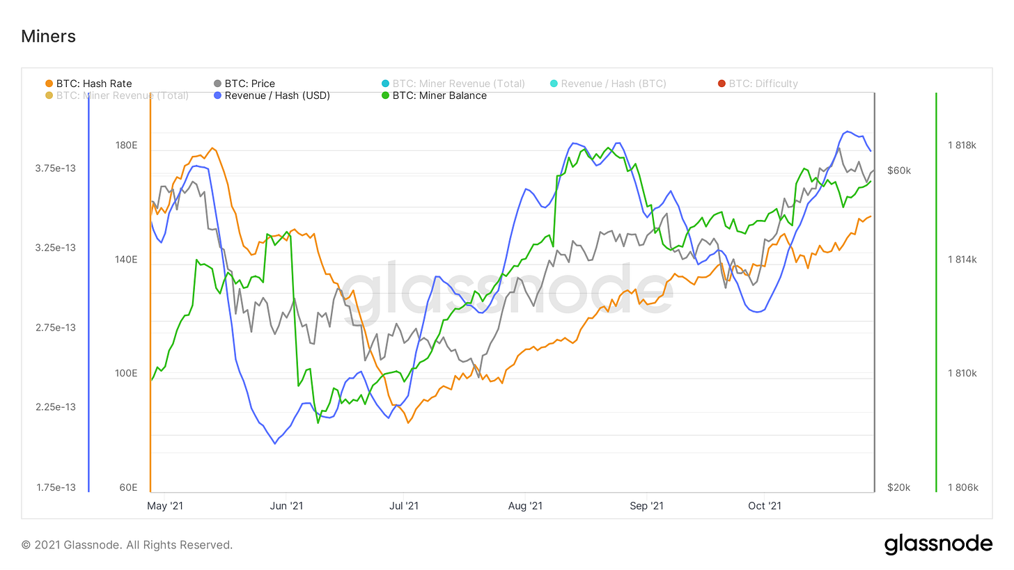
Last but not least, we take a peek at what’s going on with miners. We’ve had 7 straight positive difficulty adjustments in a row, which is just a reflection of how relentlessly hash has been coming back online. With this, revenue per hash in BTC terms continues to decline, but rising dollar prices have kept revenue per hash in USD terms at levels comparable to earlier this year. As far as miner balances go, have seen some slight accumulation this week.
Side Note: The Blockware team has been working hard to create a free indicator dashboard integrating a lot of the data included in this newsletter and some of my tweets. Keep an eye out for the announcement, coming soon!
Global Macro (written by guest writer Nik Bhatia):
Things are heating up in the rates world. Yield curves all around the world are in flattening mode, sending a strong signal to the market that momentum is shifting in the global economy. I believe understanding the sequence of events leads to a better understanding of Fed actions and the direction of interest rates.
Let’s begin with inflation. The global economy is hot, and demand is robust. This puts a natural upwards pressure on prices. Supply chain constraints have then compounded price pressures, resulting in multi-decade highs in inflation around the world. The inflation however, despite all the central bank monetary stimulus since the pandemic began, is not a monetary phenomenon. A dearth of west coast truck drivers, Chinese zero-tolerance policy toward the virus, and a global chip shortage are not monetary sources of inflation. The Fed and other central banks are forced to respond to inflation by tightening monetary policy regardless, even though higher interest rates are not going to suddenly make truckers appear at the ports of Los Angeles and Long Beach.
Next, the tightening. As 2021 began, central banks were engaged in ultra-loose monetary policy—rates anchored to zero and bond purchase programs turned to maximum. This is now being reversed; the Fed will announce a taper in November, and QE is scheduled to end sometime next year. The market then expects the Fed to begin hiking rates in late 2022. This is being expressed as a “policy error” by the yield curve.
The 5s30s curve (30-year US Treasury yield minus 5-year yield) has flattened aggressively over the past six months. This is called the “policy error” trade—5-year yields increase as they respond more directly to monetary policy, while 30-year yields decrease as long-term growth expectations come down. The market is suggesting that the Fed tightening will slow down the economy and eventually cause a policy reversal, in which rate hikes become rate cuts again. Right now, the market is potentially placing that date of policy reversal in 2024. Just a few months ago, the hiking cycle was expected to continue into 2026. Yield curve inversions ALWAYS precede rate cuts. Watch the flattenings closely.
You can check out Nik’s newsletter here:
Bitcoin-related equities (written by Blake Davis):
To me, this current environment feels like a watch and wait market. There are a few variables that raise some red flags to me so instead of panic selling, or blindly buying the dip, it is likely the safest move for me to just sit with my current holdings. I have found that over-trading is the biggest enemy of my equity curve. It is very easy to trade around too often and erode profits away (don’t forget taxes). My investment decisions are largely based on the amount of cushion in that position. Cushion is how much percent you’re up in that position. Having 20+% of cushion tells me I can be more relaxed as long as my position isn’t breaking longer term moving averages on volume. Those who’ve bought and held over the last couple weeks should have some solid cushion that protects us from smaller drawdowns.
This week we’ve seen both the Nasdaq and S&P running into resistance around all-time highs. If we do some more digging, it’s fairly obvious these indexes are being held up by a few big names like MSFT, TSLA and GOOGL. The indexes aren’t weighted equally, a few large companies account for the majority of the indexes price action. When we go through charts of some smaller, or less weighted, companies we can see that most of the tech names have been pulling back despite the indexes near highs. This is a red flag that says to me, things aren’t as strong as they seem. This isn’t necessarily a signal to me to start selling, but as I mentioned, this is another sign that I need to sit back and just ride the wave.
An easy way we can look at the action under the hood of the indexes is to look at equal weighted ETFs. QQQE is the Invesco Equal Weighted Nasdaq ETF. Below we can see how, despite a pretty strong few days on the regular QQQ, most of the market has been pulling back. I’ve drawn the current Darvas box on this chart. A Darvas box is a technique of technical analysis invented by Nicolas Darvas in the 1950s. A box can be identified by finding the current support and resistance area. Usually, running into resistance at the top of the box often leads to a retest of the bottom of the box. Luckily for QQQE, all of its moving averages are inside it’s box, not too far from current price. I would like to see it continue to hold this 10EMA (yellow), notice how this moving average lines up with a previous area of resistance.
Another thing to watch is the price action of Bitcoin. As of writing on Thursday, BTC is stuck in a declining range between its 10 and 21 EMAs. This could potentially be a dangerous area if it continues to struggle to surpass the 10EMA. To me, BTC looks more like a cup+handle than it looks like a topping pattern. If you are unsure what a cup+handle pattern is, check out my description of it at the bottom of the Week 10 newsletter. With both Bitcoin and the traditional market indexes near highs, this is a potentially huge opportunity for our crypto-exposed stocks.
In my opinion my top crypto-exposed names are mostly unchanged from last week: HUT, SI, COIN and MARA are still performing well. I would also add BITQ to this list. There are a couple other names to be watching too.
VYGVF: Voyager Digital had a huge day Thursday up almost 37% on +475% volume. This is on news of Mark Cuban and the Dallas Mavericks signing a 5 year partnership with Voyager. Anytime we see price up on massive volume it’s something we should keep an eye on. It should be noted that VYGVF has been in a downtrend for almost 7 months. Stocks that bounce while in a downtrend are much more likely to see gains sold as people who’ve held it downwards see an opportunity to get out of some of their stock. This is why I consider this a stock to watch, not something I’m ready to be buying yet.
BRPHF: Galaxy Digital also has had a huge week, up 46% on the week as of the time of writing. Thursday, BRPHF was up 17% on +147% volume. There were a variety of bullish news articles posted about Galaxy this week. But basing investing decisions on news stories is a losing game, yet I do find it beneficial to know what’s going on in the company. At the end of the day, price is what pays. Big price increases on volume is a sign of institutional accumulation. I wouldn’t want to be buying here as it's already up huge on the week and is now extended. This is something I’m watching to form a buyable continuation pattern.


How are there only 17 likes on this?? Crazy stuff. This analysis is absolutely key for anyone adopting bitcoin 💪Thank you, as always 🍻
it would be great to have links to your charts via glassnode. :)