Blockware Intelligence Newsletter: Week 15
Bitcoin on-chain analysis & equity-analysis; overview of 11/13/21-11/19/21
Dear readers,
Hope all is well and you had a good week. Have seen a lot of unease on Twitter and overall sentiment seems fearful/on edge. However, as always we will objectively/unemotionally look at the data to come to any conclusions/market outlook. We’ll look at some short-term data as well as zoom it out to remember the macro on-chain setup.
Two weeks ago we talked about a volatility squeeze that was forming and how often times they break in one direction to grab liquidity from breakout traders before reversing. This has now played out for the fourth time in a row and is something we should continue to watch for moving forward. This current pullback has been driven by spot selling more than liquidations, particularly Bitfinex which has been trading at a discount to other exchanges for a good portion of the last few days.
One of the red flags that we were likely headed lower was on Tuesday when the price was dropping but funding was rising. Overall funding has reset a bit, although I would love to see a final leg down to flip funding fully negative.
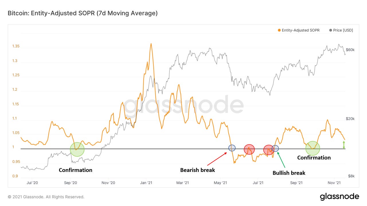
Next up we’ll look at our family of SOPR metrics. (spent output profit ratio) Short-term holder SOPR is a good oscillator to identify buy the dip/fade the rally opportunities: Given we have identified the broader trend using other metrics**
We’ve fully reset this metric, meaning that if we are correct about the broader market structure being bullish, we are close to bottoming out if we haven’t already.
Weekly SOPR paints a similar picture. We got our bull trend confirmation at the end of September, but it wouldn’t hurt to get another reset/retest of 1 if we see one last leg down. Just for reference what you don’t want to see is a break below 1 and then failed underside retest of 1.
Short term holder profit/loss ratio is another oscillator similar to SOPR, but just compares the amount of profit/loss that short-term holders are currently sitting in, rather than what they are realizing. SOPR only takes into account the coins that are being spent on each given day.
Similar to weekly SOPR, we got our bull confirmation in late September, but would love an opportunity to buy along the 1 threshold if given. Note in late 2020 we got two retests of the 1 threshold before continuation.
Using all 3 of these metrics paints the best picture, confluence is always key.
Next up we look at short-term holder realized price, or cost basis. This is essentially an on-chain VWAP, or volume-weighted average price of entities that have been active in the market for less than 155 days. Interestingly, this has served as a bull market support band historically. Note in 2017 the numerous failed underside retests of the band, leading us into the bear market. After reclaiming and bouncing off this in September (notice the confluence across all these metrics at the end of September) we are back in bull territory. This currently sits at $53K, which coincides with technical support as well as the $1T market cap threshold. I personally started averaging in buys sub $60K (not financial advice) but wouldn’t be surprised to see us go as low as $53K. No need to be concerned as long as we are closing* above $53K in my humble opinion.
TLDR from looking at some of these shorter-term metrics: the end of this correction is likely near if we haven’t seen it already. Probably see some sideways consolidation afterward.
Now let’s zoom out a bit to get a reminder of the bigger picture.
On a similar note of realized price, or cost basis, we look at on-chain cost basis ratio. This compares the realized price of short-term holders (what we just looked at above) to the realized price of long-term holders. Runing the ratio of the two offers an interesting macro oscillator. Whenever STH cost basis blows out and overextends LTH, it’s time to be cautious. When LTH cost basis crosses below STH, it’s time to accumulate. Note we never reached the “overheated” zone earlier this year and reset similar to 2013. It took 3 months to go from resetting between the 2013 double pumps to reaching the overheated zone, so even though we are currently far from that it can come quickly.
MVRV z-score, which compares realized price to market price and then adjusts it for volatility, paints a similar picture. The idea here is that whenever the speculative bid overshoots the actual amount of new capital inflows to the network the market is in a state of exuberance or if “overheated”.
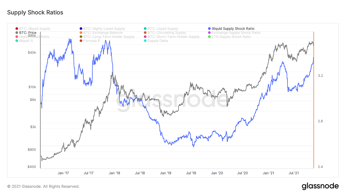
Looking at our illiquid supply shock ratio, still no sign of concern. This compares highly liquid and liquid entities to illiquid entities, in laymen’s terms weak to strong hands. Currently strongly at 2021 highs and climbing. What we are watching for is a strong decline for a week or two to become cautious: this is what happened at the 2017 peak as well as the early 2021 peak. This was also a leading indicator over summer as it painted a clear bullish divergence; climbing while price was dropping. Note the similar signature in the two “peaks” to 2017; only difference is now ISSR have made new highs versus in 2017 it didn’t, so back then you could make the argument of a slight bear div.
As we have been watching like a hawk, long-term holders have continued to distribute, as per natural bull market behavior. Remember, long-term holders scale into weakness and scale-out into strength. Last year they started distributing in late October. Upticks in old coins being spent also reflected in coin days destroyed, dormancy, average spent output lifespan, spent volume age bands, spent output age bands, etc.
Lastly we look at dormancy flow, which compares market cap to the USD value of annualized dormancy. Dormancy is coin days destroyed divided by volume, which just gives you the adjusted amount of coin destruction. Currently far from any exuberant signature no matter how you want to look at it.
Bitcoin-related Equities(written by Blake Davis):
Another tough week of price action for holders of Bitcoin and the equities exposed to it. With the continued pullback in BTC we have seen the same in our crypto-exposed names. In my opinion, this pullback looks to be getting long in the tooth, at least in the short term.
It has been interesting to watch how price behaves around different levels in a correction. I noticed BTC would usually find support around key levels and moving averages, and then later be overwhelmed with sellers to take out those levels. At the time of writing, we are seeing BTC hold a key moving average, the 65 day exponential moving average. Bitcoin has respected this moving average before so it will be interesting to see what it does here. I wouldn’t be surprised to see us undercut it on a daily close Thursday or Friday and then rally, at least as an oversold bounce.
There are two key levels of support I see on the chart of Bitcoin. Below you can see two trend lines in white. These two support levels line up at the previous resistance near $53000. I see this as a floor for prices in the short-term. But instead of trying to guess price levels, it’s much safer to see them play out in real time and then react accordingly. At the end of the day, I believe this is just a pullback before continuing higher in a bull market. The opportunity on the other side will be great for us as long we remain convicted on the way down. Hedge fund manager Jim Roppel always says you have to be able to sit to the 50 day. Conviction in the fundamentals, everything Will has written over the last few months, makes it easier to sit through volatility.
Regular growth stocks are holding up very well through this. I think the equal weighted S&P 500, RSP, gives a good look at how the best stocks are behaving right now. Below you can see that RSP held the blue 21 exponential moving average on Thursday. Whether or not this will continue to hold is up in the air but this is a strong sign of strength for now. The strongest growth stocks look even better, holding at or above their 10EMAs. It feels like the crypto correction certainly has an overall effect on the rest of the market, but the degree a stock is affected depends on the individual name’s relative strength.
I think the most exciting and interesting thing for anyone to be watching is the process of decoupling beginning to occur in the crypto-exposed market. As I’ve discussed here numerous times, crypto-exposed stocks generally just follow this price of BTC. Institutions appear to have weaker convictions in this market versus the traditional stock market. This is why companies who profit regardless of Bitcoin’s price are still sold on days when BTC is down. What we are beginning to see now is names begin to decouple from the spot price of Bitcoin.
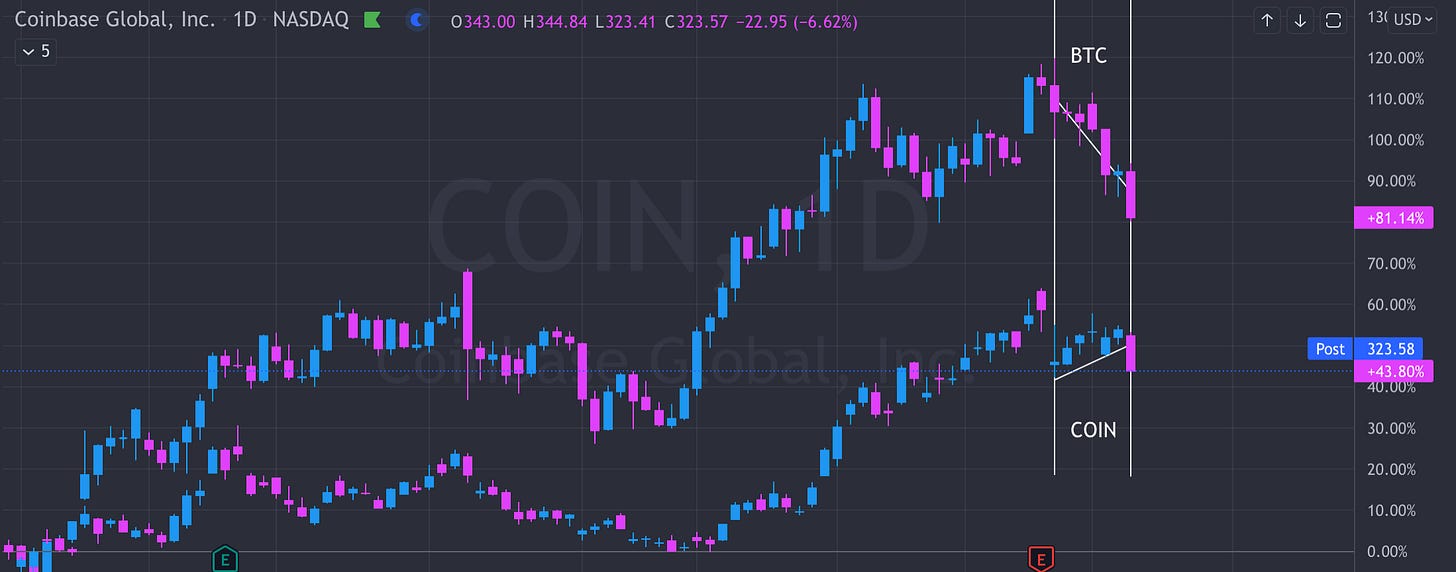
Coinbase, for example, has had positive price bars and consolidated sideways the last 6 sessions before Thursday while BTC corrected downwards. COIN is showing it’s hand as a stock being aggressively accumulated institutionally. As firms begin to understand the value of a company like COIN, the price of BTC on that day is somewhat irrelevant. As we talked about last week, Coinbase has lots of projects they are working on to expand the accessibility of their products to the crypto customer base. NFT’s, internet 3.0 and DeFi are a few of the ways that Coinbase is changing the world and it is clear that financial institutions are becoming aware of it.
Below is a price chart of BTC displayed on top of a chart of COIN. Here we can clearly see the divergence in price action. Thursday COIN pulled downwards alongside BTC, it will be interesting to see what happens Friday.


I would appreciate if the writing could follow the logic of (1) what it is we look at (2) what the data says and (3) what the interpretation is. I love Will's work but the clarity of writing could improve as it still sounds a bit like expert gibberish. The true art here is simplification without losing specificity and synthesizing the insights. Pleased to help if I can.
Thank you from Australia, absolute legend. Easily digestible and invaluable knowledge.