Blockware Intelligence Newsletter: Week 53
Bitcoin on-chain analysis, mining analysis, macro analysis; overview of 8/27/22-9/2/22
Blockware Intelligence Sponsors
If you are interested in sponsoring Blockware Intelligence email: sponsor@blockwaresolutions.com.
Blockware Solutions - Buy and host Bitcoin mining rigs to passively earn BTC by securing the network. Your mining rigs, your keys, your Bitcoin.
Know someone who would benefit from concierge service and world class expertise when buying Bitcoin? Give them one year of free membership in Swan Private Client Services ($3000 value) -- email blockwareHNW@swan.com and we’ll hook it up! (And yes, you can give it to yourself 🤣)
Podcast
After reading the newsletter make sure to check out this week’s podcast featuring Greg Foss!
Foss is notorious for his catch phrases including “It’s just math.”
Blockware analyst Joe Burnett interviews Foss on the future of bonds, fiat currency, and Bitcoin. Check it out!
Summary
The S&P 500 returned -4.24% in August compared to the average August return of 0.45%. We now head into September, the historically worst month for equities.
After reaching extreme oversold levels, the Nasdaq staged an upside reversal above a key level on Thursday to usher in a potential short-covering relief rally or consolidation.
The US Dollar Index made 20-year highs on Thursday, and Treasury yields spiked accordingly.
The Chicago Fed’s National Financial Conditions Index is indicating that despite the Fed’s best efforts, they are not doing enough to tighten financial conditions.
Short Term Holder Cost Basis, Mayer Multiple, and Puell Multiple indicate the Bitcoin is likely near a bottom.
Retail participants have been aggressively stacking Bitcoin.
Long term holders have been accumulating in spite of the negative price action.
A record low 6.1% of the circulating Bitcoin supply has moved in the last month.
Mining difficulty increases by over 9% as Bitcoin’s hash rate rips back with vengeance.
Increasing energy prices weigh pressure on Bitcoin miners.
General Market Update
It’s been another fairly brutal week of price action and we have lots to discuss here today. One of the more discussed topics this week has been uranium.
The visual above shows us the performance of several energy commodities over the last week. Clearly, something is going on in the nuclear energy market.
Uranium and nuclear power were in the news a lot the last week or two, with a reactor offline in France, and one close to destruction in Ukraine.
Sweden announced on Wednesday their goal to build 10-12 new reactors. But with the spike in German energy costs, as discussed here last week, the market was likely pricing in a higher reliability on nuclear power in the future.
But this week we saw European energy prices come crashing down, as measured by the German Year-Ahead Baseload Power price.
German Year-Ahead Baseload Power 1D (Tradingview)
It doesn’t appear as though any fundamental characteristics have changed for the European energy landscape, but it is likely that this energy rally has been fueled by a lot of late stage speculation. This could explain one factor that led to the ~44% drop in German power costs this week.
Wednesday marked the final day of August which gives us the opportunity to look at monthly data.
Above is a visual that shows us the average monthly returns of the S&P 500 in comparison to January-August of 2022.
The first thing you’ll likely notice is the mean deviation of this year’s returns. It’s important to note that the historical averages are taking into account 121 years of data. An average is never going to be as volatile as looking at a one year sample.
Furthermore, bear markets are usually much more volatile periods of price action in comparison to bull cycles. That being said, we mostly created this graph for readers to visualize the seasonal nature of equities.
There are times of the year where equities tend to outperform vs. others. Historically speaking, the early fall is a poor time for stocks.
The reason for this is not black-and-white. It’s likely a human behavioral explanation, or simply coincidence, but that being said, September is historically the worst month for stocks.
This is the forefront reason why this chart is included this week. As we’re now in the month of September, it would likely do you some good to keep in mind the historical context of this month.
On more of a micro-level, we’re currently seeing the weakness in the market potentially catching an oversold bounce.
QQQ 1D (Tradingview)
The defining day this week was on Tuesday. On Monday, the Nasdaq ETF QQQ was able to close above its 50-day SMA (red).
The 50-day is what we like to refer to as the guardrail. The saying goes, “Nothing good happens under the 50-day”.
This quote is spoken from the perspective of the intermediate term investor. There are, of course, countless trading opportunities on bounces below the 50-day, but from a longer time horizon, the 50-day is a major trend indicator that tells us what sort of macro headwinds are shaping current price action.
The market cannot enter a true uptrend unless it’s, at the very least, above the 50-day. On Tuesday, QQQ very clearly signaled to investors that buyers are not in control.
Furthermore, on Thursday, the ETF gapped down 85bps to undercut a key AVWAP, but ultimately formed an upside reversal to recover that level.
The teal line above shows the current Volume Weighted Average Price of QQQ going back to the market bottom on June 16th.
This is a key spot that bulls would like to see buyers stepping in. This provides investors with an opportunity to accumulate shares at a level that’s “average”. In other words, the average investor’s cost basis since we bottomed is currently at $297.33. Price re-entering this level allows investors to defend their position and cost basis.
As of Thursday, buyers were successful in doing so, signaling a potential switch in bid strength for the near-term. Currently, QQQ is quite oversold, with price being nearly 5% below its 21-day EMA.
We are due for another short-covering bounce, whether Thursday marks the first day of that is impossible to say, but it certainly isn’t a bad sign for bulls in the near term.
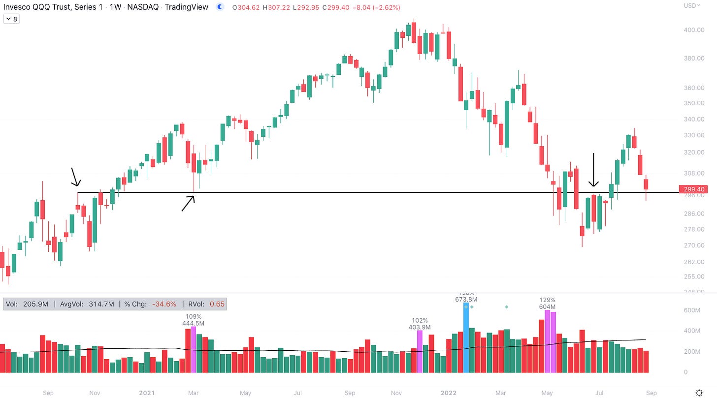
Furthermore, QQQ bulls were able to defend a major support level dating back to 2020.
QQQ 1W (Tradingview)
For a more zoomed in look at this level, refer to the first QQQ chart that shows it as a horizontal black line. Above you can see where this price level has been relevant in the past.
More recently, this level became upper resistance during the sideways wedge formed from June-July. This was a level we were hoping to see buyers step in at, and coincidentally it aligned almost perfectly with the previously discussed AVWAP.
CBOE Equity-Only Put/Call Ratio 1D (Tradingview)
The chart above shows us the equity-only put/call (P/C) ratio. This is a sentiment indicator that measures investor attitudes by comparing the direction of trades placed on derivatives.
A high P/C (>1.0) tells us that investors are overwhelmingly bearish. As you may have learned the hard way, the market almost never does what the masses are expecting. Therefore, when the market is pessimistic in aggregate, it generally means we are due for a relief rally.
That all being said, sentiment can always go from bad to worse. As you can see above, sentiment was already worse in June and July, and it would take a fair bit more downside for us to reach those levels.
DXY 1D (Tradingview)
On Thursday we also saw the US Dollar Index breaking out of its short consolidation zone to make a new 20-year high.
As we’ve discussed in this newsletter plenty of times, the appreciation of the global unit of account tends to have adverse economic effects. With exporters squeezed, and the US government’s deficit increasing in value, it isn’t much of a shock to hear that periods of a climbing DXY generally place sell pressure on equities and fixed-income instruments.
US10Y Yield 1D (Tradingview)
This week we’ve seen a climb in Treasury yields, indicating an increasingly aggressive selloff in the bond market.
As yields rise, the discount rate used to valuate equities is also rising, meaning that the present value of expected future cash flows is being devalued.
In layman’s terms, institutions believe that their stocks are now worth less, causing selling. Throughout this year, we’ve seen the bond market operating as a leading indicator of what’s to come for stocks.
While this relationship isn’t 1:1, meaning it takes time for moves in Treasuries to spill over into equities, the bond market is indicating that stocks likely have more downside to come.
In the near term, as we’ve just discussed, stocks are likely due for some sort of rally, or at the least a short consolidation, before continuing selling off.
Initial Jobless Claims (FRED)
Initial jobless claims are indicating that the labor market remains strong. Last week this number came in at 232,000. This marked the 3rd straight week of declining unemployment.
According to a report by Reuters, layoffs announced by US firms dropped by 21% in the month of August.
Looking at real wages paints a different picture, showing us that although most people are working, wages are being eroded by inflation at an alarming rate.
Above is the National Financial Conditions Index provided by the Chicago Fed. This data point provides us with an idea of the strength of various aspects of the macroeconomy.
When the index is positive, it tells us that economic conditions are tight. Last updated on Wednesday, the Chicago Fed’s research indicates that financial conditions are actually loosening.
This is despite the Fed raising interest rates at an extremely aggressive pace. The Chicago Fed’s NFCI is telling us that the Fed simply isn’t doing enough to slow down the economy.
FOMC meets next in 3 weeks on September 21st.
Crypto-Exposed Equities
Unsurprisingly, it has been another tough week of price action among crypto-exposed equities.
One big news story came on Thursday with the announcement of the DC attorney general’s suit against Michael Saylor for alleged tax evasion and MicroStrategy’s role in aiding it.
We, obviously, have no insight into the matter and won’t touch on it beyond the headline, but it is certainly something for MSTR investors to keep an eye on.
MSTR stock was down ~3.6% on the news.
Despite the weakness among most of the industry group, there are a few names that stand out to us from a price structure perspective. Generally speaking, the strongest names at the moment are the ones that have been able to hold their lows from August 22-23.
A few examples of names showing superior relative strength this week are: CIFR, BRPHF, BKKT, MIGI and HIVE. That being said, relatively higher strength doesn’t mean that these stocks are out of the water by any means.
As mentioned previously in this newsletter, the market could be due for a bounce or consolidation here, but crypto-equities are extremely beaten down and are best for dollar-cost averaging down here.
Above, as always, is the table comparing the weekly price performance of several crypto-native stocks.
Bitcoin Technical Analysis
It’s been a pretty quiet week for spot Bitcoin, which likely isn’t a good thing following last week’s decline. At the moment, it looks like BTC is putting in another bearish consolidation as we saw a week ago.
BTCUSD 1D (Tradingview)
Thus far, buyers have been able to defend this ~$19,600 level. A break below this level would likely end in a test of support at $18,600, or potentially the YTD lows of $17,600.
Furthermore, note the declining 10-day EMA hanging overhead (in green above). This has repeatedly been a place for sellers to step in over the last 3 weeks or so.
It’s fairly likely for price to continue this sideways consolidation and for volatility to contract between the 10-day and support at $18,600. From there, it’s anyone's guess if we break up or down, but the trend indicates that it’s more likely down than not.
Bitcoin On-chain and Derivatives
The Short Term Holder (STH) Cost Basis and Long Term Holder (LTH) Cost Basis are on a collision course. Currently, STH Cost Basis sits at $25k and LTH is at $23k.
Most of the time: STH Cost Basis > LTH Cost Basis. This is because new market participants (STH) are buying at much higher prices relative to LTH.
However, during past bear markets: STH Cost Basis < LTH Cost Basis.
There are two reasons for this. First, as the price goes down from the all-time high, STH are able to average in at lower prices while LTH are still buying at a price that is high relative to where they bought previously. Second, each bull run breeds a new cohort of convicted bitcoiners. In other words, STH ages into LTH which increases the LTH cost basis.
If/when STH Cost Basis goes below LTH Cost Basis it will likely be a great time to Dollar-Cost Average.
The Puell Multiple, a frequently cited valuation metric, has re-entered the value zone.
Coined and created by David Puell of Ark Invest, the Puell Multiple measures the daily issuance value of bitcoin (in USD) relative to the 365-day moving average of the daily issuance value.
The Mayer Multiple measures the range between the Bitcoin price and the 200-day moving average. When Mayer Multiple = 1, Price = 200-day moving average.
The 200-day moving average is widely accepted as a broad based long-term trend indicator and the Mayer Multiple is currently at a level only seen during Bitcoin price bottoms.
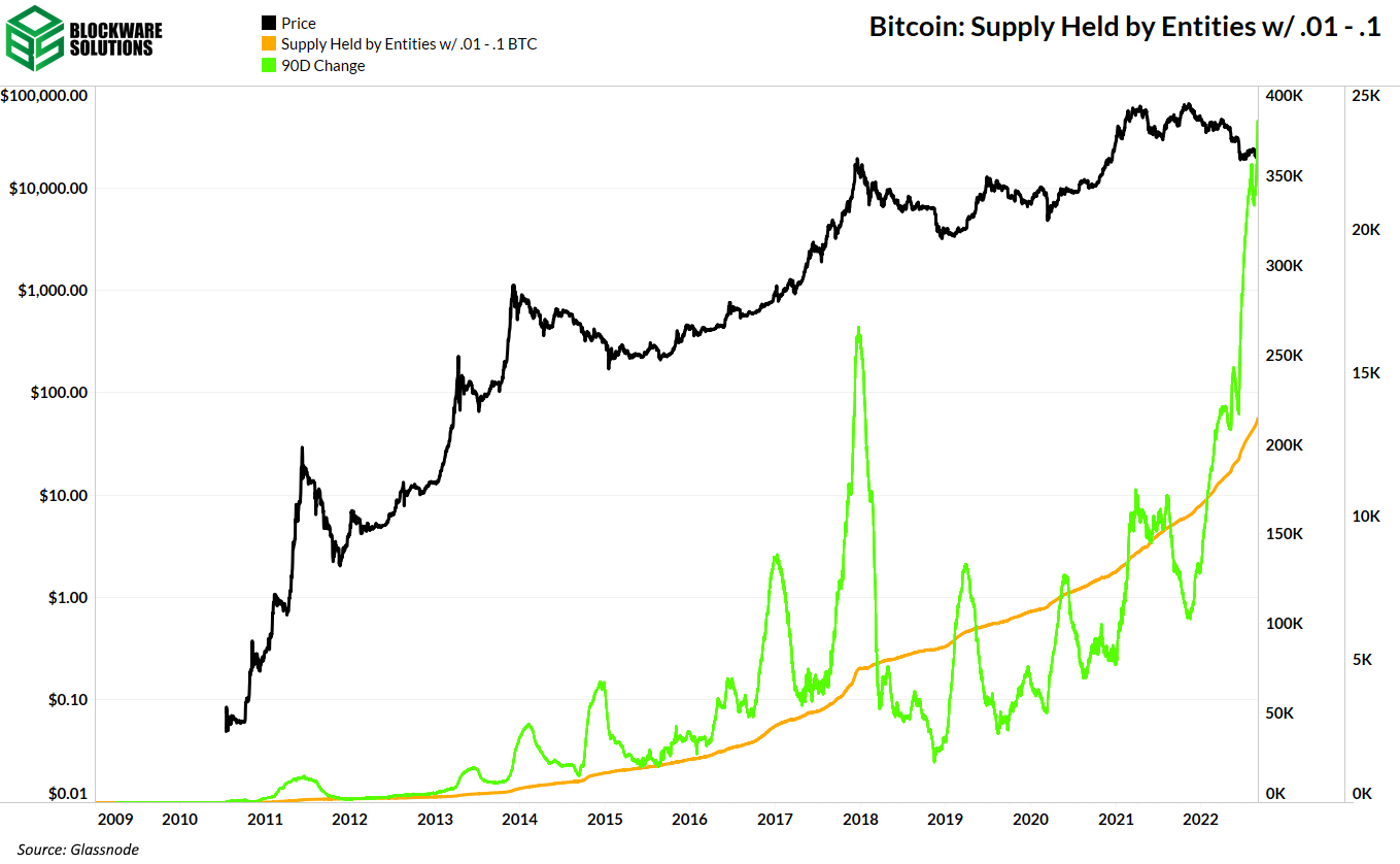
Despite the negative price action this year, retail has been accumulating heavily.
The supply of BTC held by entities with .01 - .1 BTC and .1 - 1 BTC has increased tremendously. The 90 day change in these metrics has reached an all time high indicating that the drop to $20k in mid-june has not shaken retail one iota.
These retail sized entities have “bought the dip” previously but not with near as much volume as this time around. Perhaps this is an indicator that people are less concerned with BTC’s fiat denominated price.
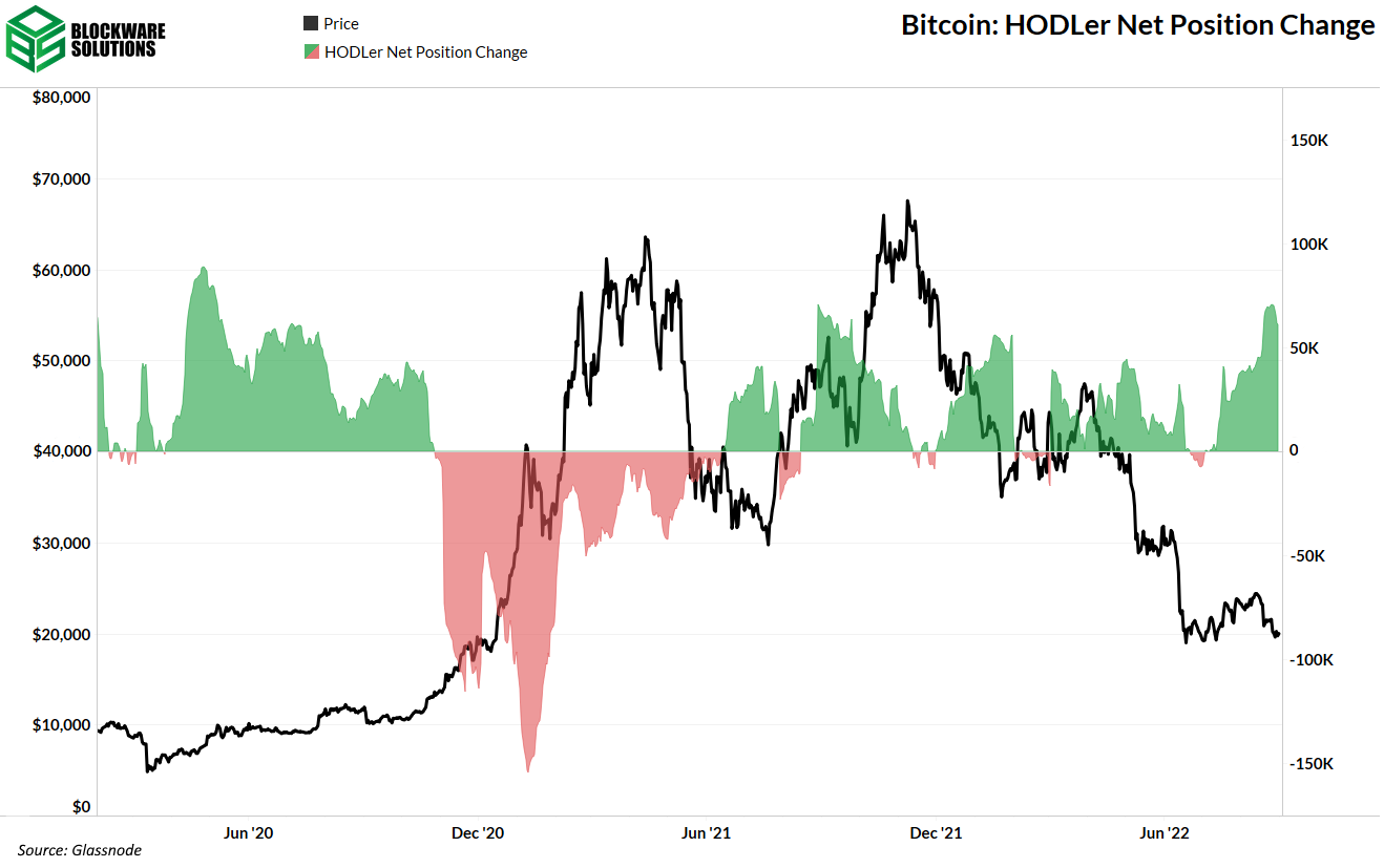
To go further on the accumulation behaviors, HODLers of all bag sizes have been accumulating almost non-stop for over a year now.
Another metric that allows us to observe the conviction and diamond-handedness of Bitcoiners is Coin Days Destroyed.
CDD is calculated by taking the number of coins in a transaction and multiplying it by the number of days since those coins were last spent.
If CDD is high that means lots of old coins are being moved. If CDD is low it means that few coins are moving and those that are are coins that have not been sitting still recently. Ie, they are coins that belong to short term holders.
The 30-day moving average of CDD is at very low levels, indicating that transaction activity is low and long term holders are hodling.
Another point to note is that during the large dip in 2018 CDD had a huge spike indicating that many older coins were moved (capitulation.) This has not happened this time around which is an indicator that conviction in Bitcoin is strengthening.
HODL waves show the percentage of Bitcoin in existence that were last moved within a specific time period. At the beginning of this week, a record low 6.1% of the circulating Bitcoin supply moved in the last month.
This is interesting for 2 reasons:
Supply is usually only active near price tops. This is because the price frenzy peaks coincide with buyers (bids) raising the price so much that eventually, the old supply decides to move and sell some of their coins. Lots of coins shift hands at parabolic tops.
When supply is not moving, that means most users are just holding. They are sitting on their hands doing nothing. There may be a clear lack of demand, but the supply is extremely tight.
The fact that Bitcoin just saw a record low percentage of the circulating supply moving in the last month provides further evidence that many of the weak hands may have already flushed out and only the strongest hands may remain.
Bitcoin Mining
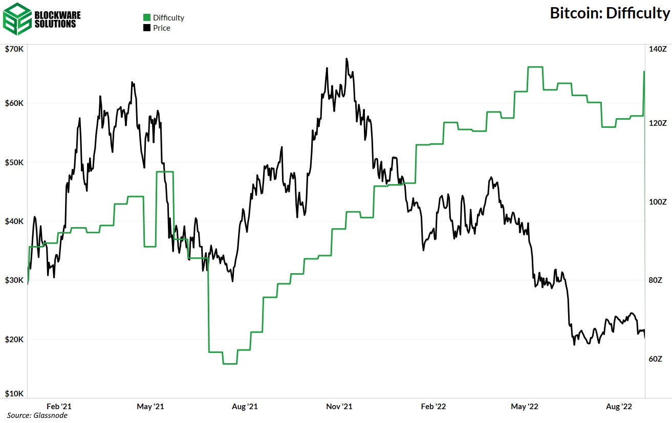
9.3% Increase in Mining Difficulty
Earlier this week, Bitcoin experienced its largest upward difficulty adjustment since January 20th of this year. This large difficulty adjustment can be attributed to two key factors:
Miners that capitulated their rigs this summer, sold them to buyers that were better capitalized and likely had access to cheaper electricity. Weak miners sell more Bitcoin than strong miners, and a fair amount of ASICs shifted hands during the capitulation this summer.
New ASICs (XPs) are likely beginning to get shipped and plugged in.
As you can see on both the difficulty chart and the hash rate chart, more rigs are being turned on and mining difficulty is on its way back to new all-time highs.
European Energy Crisis
Adam O (@denverbitcoin) from Upstream Data posted this chart on Twitter depicting the massive surge in electricity prices for Germany/Europe. The price on the chart is clearly out of the ordinary, and the cost per MWh is $1,000. This is $1.00 per kWh, a massive rate even for retail electricity prices.
Quick math enables you to calculate the theoretical price of production per Bitcoin if you are charged ~ $1,000 per MWh. With 2,339 S19s you'd be paying $175,425 in energy expenses to produce 1 BTC in the next 24 hours.
As energy costs continue to rise throughout the world, it remains critical for miners to secure and lock in cheap energy.
All content is for informational purposes only. This Blockware Intelligence Newsletter is of general nature and does consider or address any individual circumstances and is not investment advice, nor should it be construed in any way as tax, accounting, legal, business, financial or regulatory advice. You should seek independent legal and financial advice, including advice as to tax consequences, before making any investment decision.


